Published on March 3, 2020.
There’s no way around it: I love making websites. It’s tons of fun and can be really relaxing. Between school, side projects, collaborations with friends, and work, I’ve had the opportunity to build a ton of them. This is a running list of some of my favorites. Enjoy!
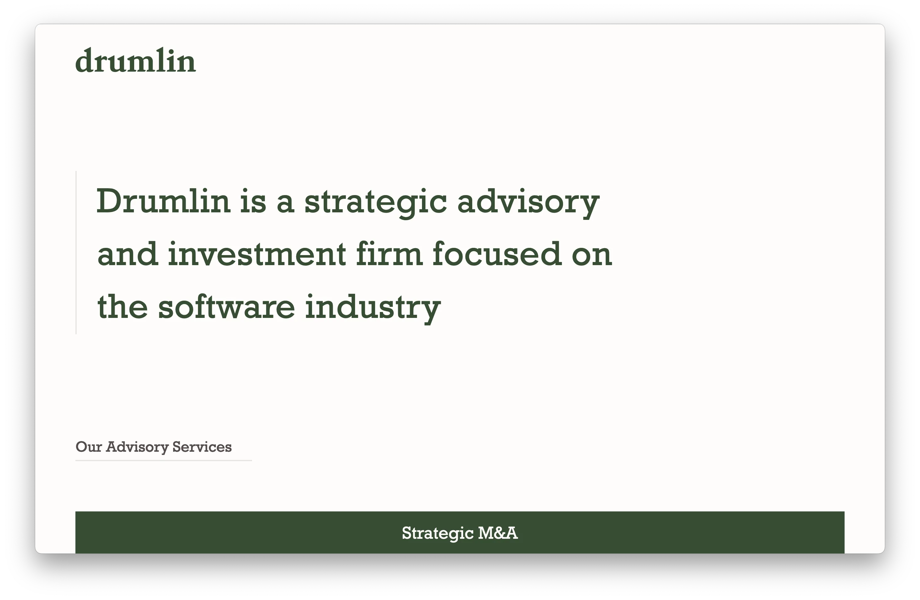
Drumlin Partners
2023 | drumlinpartners.com
I made a very simple site for Drumlin Partners, a boutique investment bank focused on the software industry. Their website features recent deals and historical transactions from their co-founders.
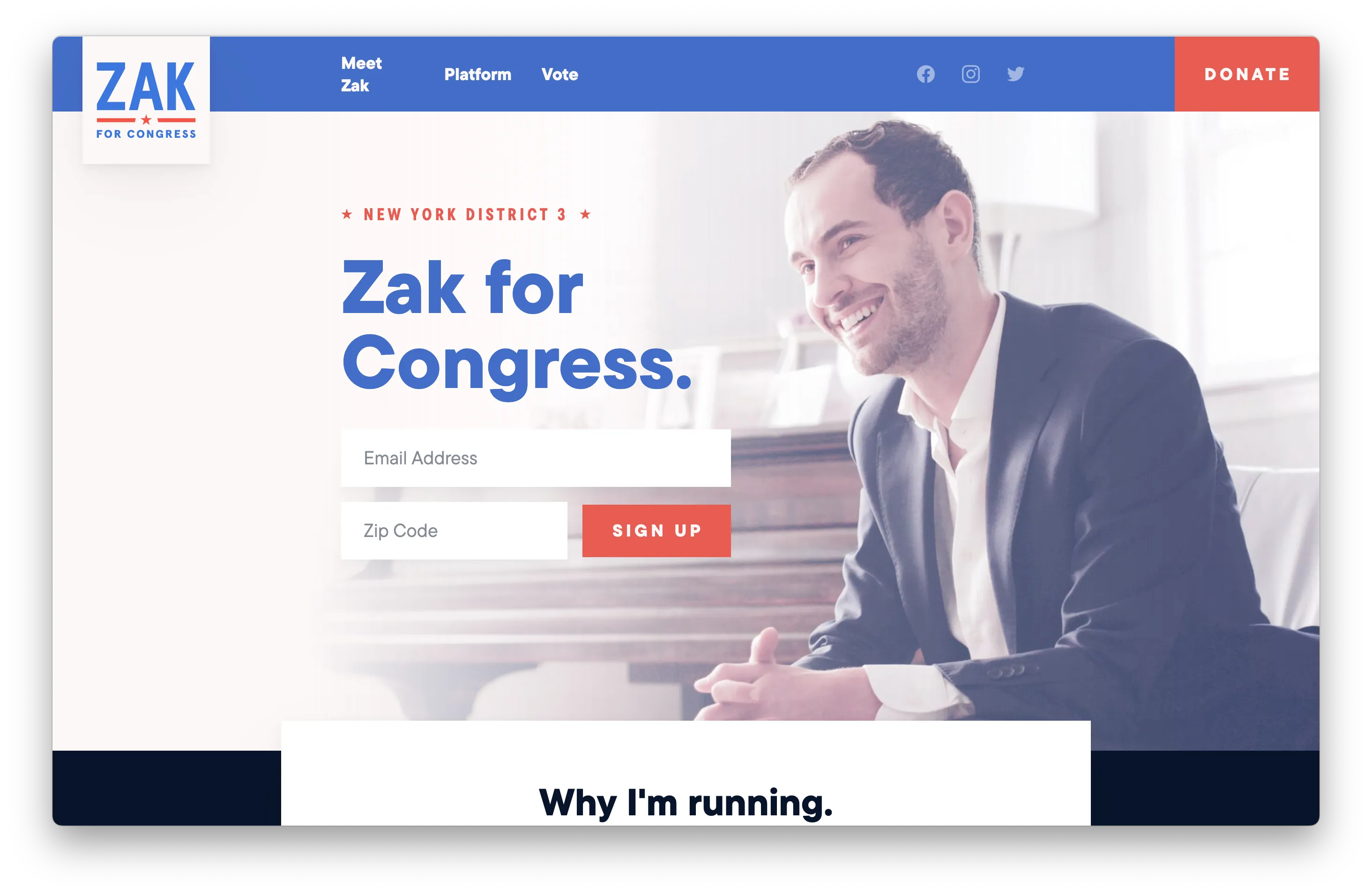
Zak for Congress
2023 | zakforcongress.com
I met Zak Malamed in our work together on The Next 50, a nonprofit focused on getting more young people involved in politics. Then, when I heard that he was running for George Santos' seat in Long Island, I was thrilled to have the opportunity to help out. As is typical for political projects, there was a tight timeline to get the site up and running, but I really like how it turned out.
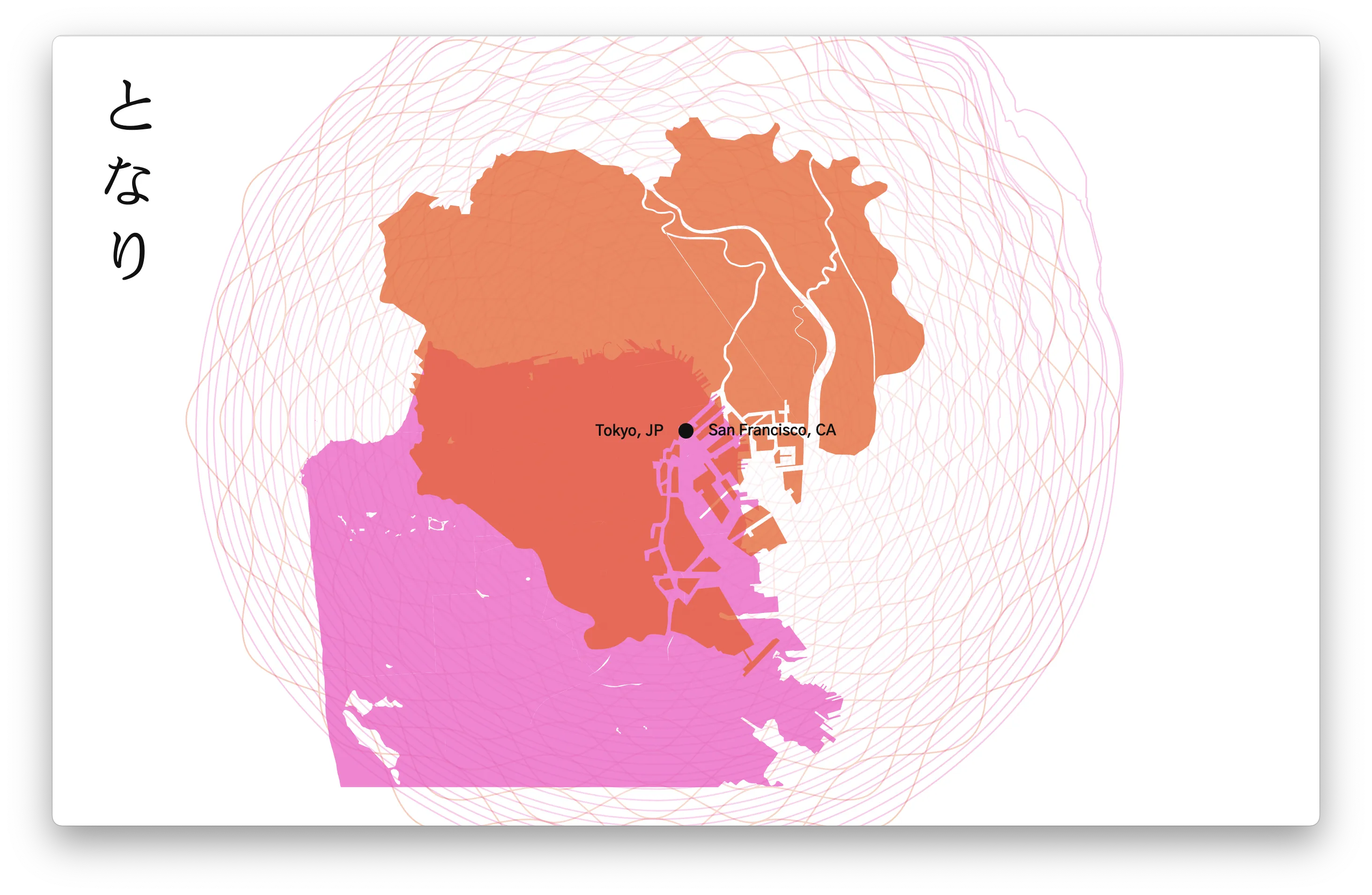
Tonari
2022 | wearetonari.com
Sophia Noel, the executive producer of Tonari, describes it as a cross cultural, cross generational, storytelling experience connecting Tokyo and San Francisco through contemporary dance, film, and jazz. When she brought the idea to me, I was immediately struck by the idea for the visual effect that eventually became the hero for their website. It was a lot of fun to see come to life!
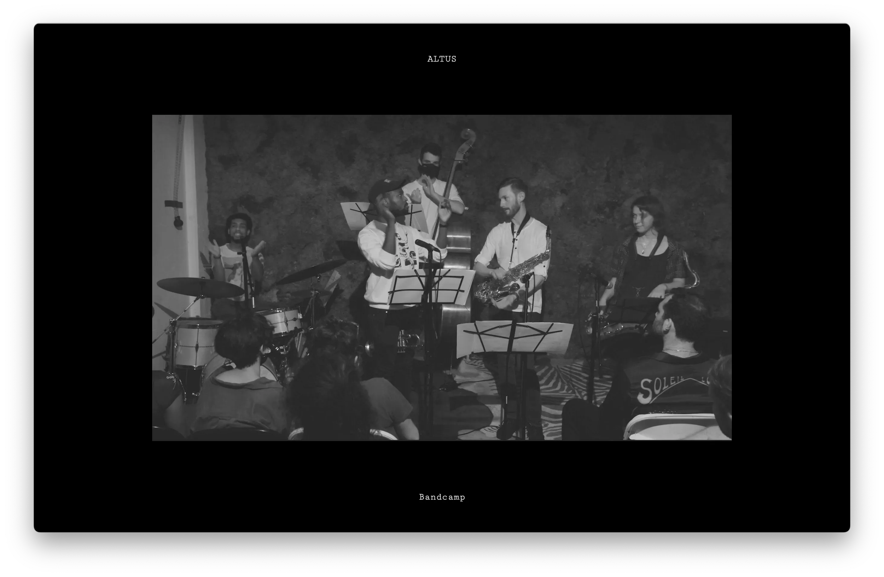
Altus
2022 | altus.band
After seeing Altus perform live at several different New York venues, I was thrilled to hear from bandleaders Isaac Levien and Dave Adewumi that they were interested in created a simple but fun website. The introductory animation syncs up with the audio from their concert film as an introduction to the band.
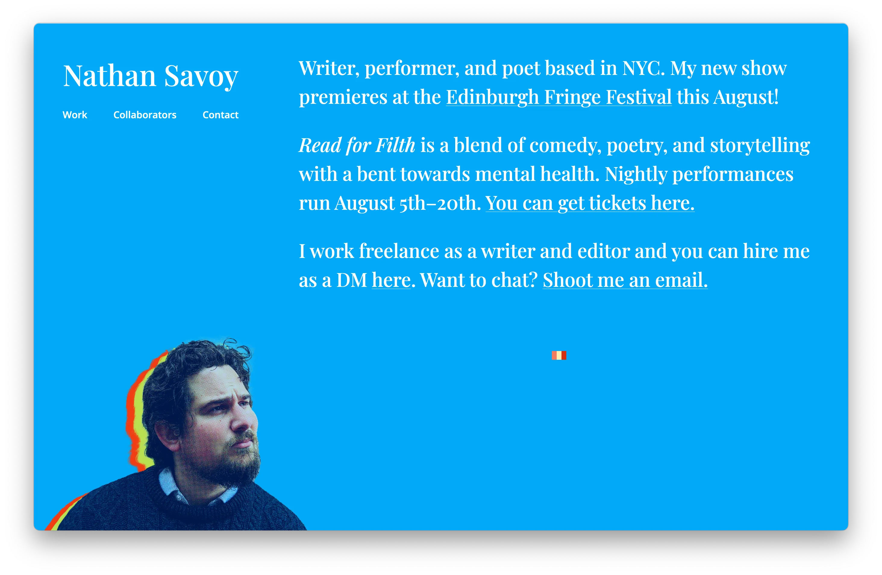
Nathan Savoy
2022 | nathansavoy.com
For Nathan's debut performance at the Fringe Festival in 2022, I created a brand and marketing materials for the show, and brought that brand identity back to his website. I love how the posterized headshot contrasts with the bright blue background.
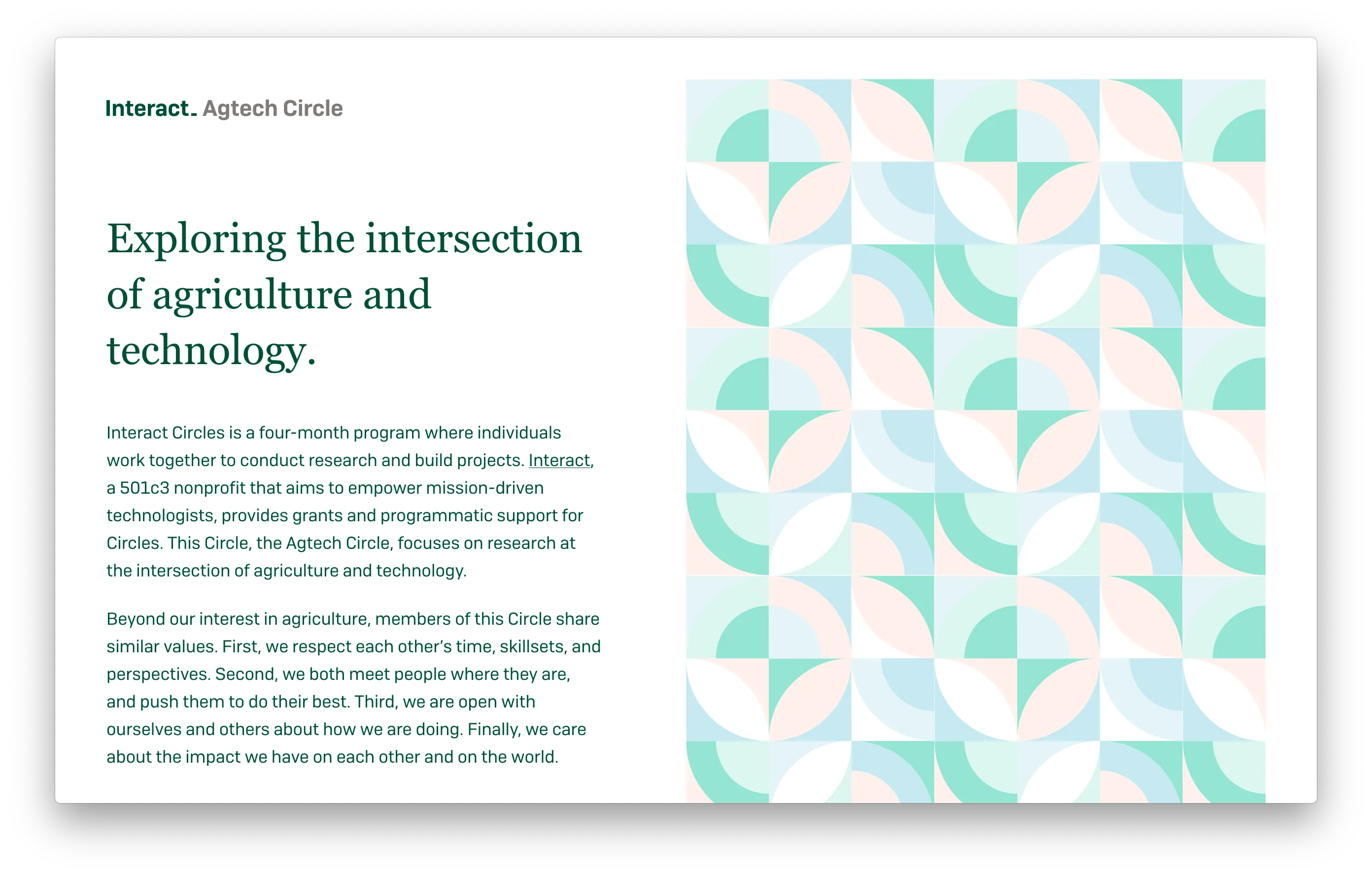
Interact Agtech Circle
2020 | circles.joininteract.com/agtech
In the summer of 2020, I joined the Interact Agtech Circle, a group of people researching the intersection of agriculture and technology. Funded by a grant from <a href="https://joininteract.com/">Interact</a>, the Agtech circle ran for four months. The site used a recolored abstract pattern from Creative Market to great effect.
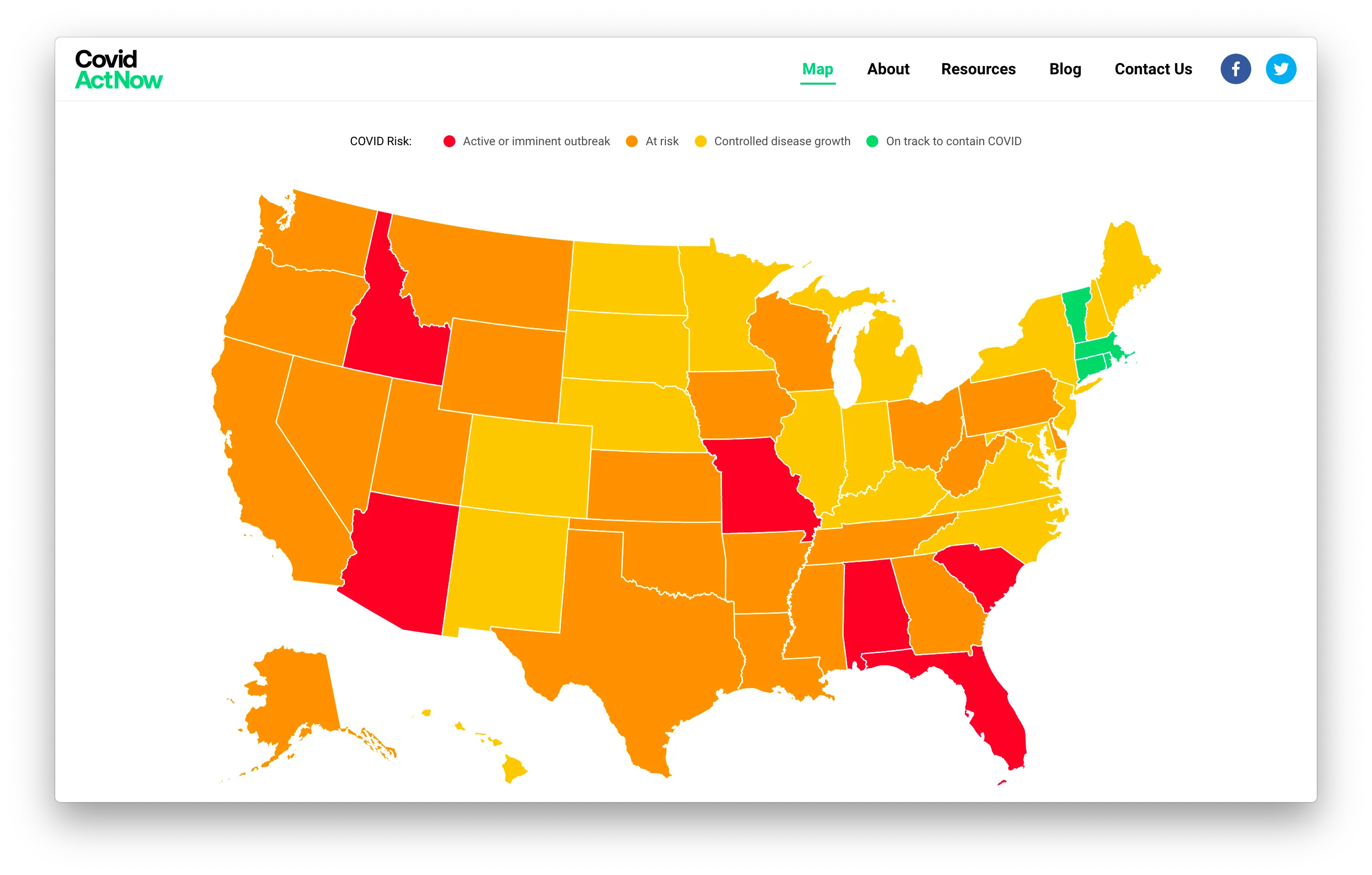
Covid Act Now
2020 | covidactnow.org
In the first few months of the COVID-19 crisis, I worked with the team at Covid Act Now as a product manager and frontend developer to rebuild their website to display COVID preparedness at the state and county level. Working with a talented team of designers, engineers, policy experts, data scientists, and more, I helped the team revamp the website several times in the short two months that I spent helping out.
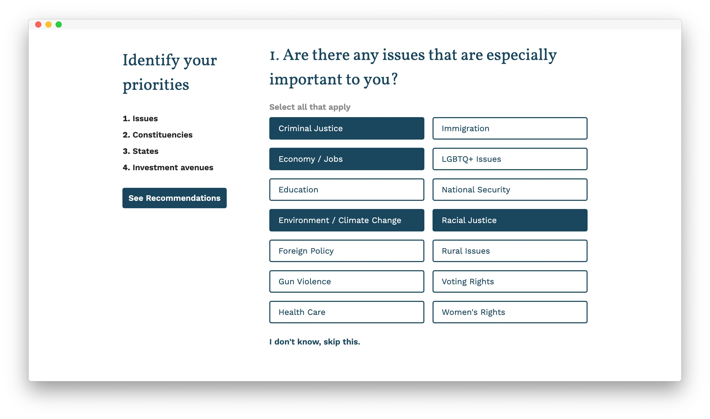
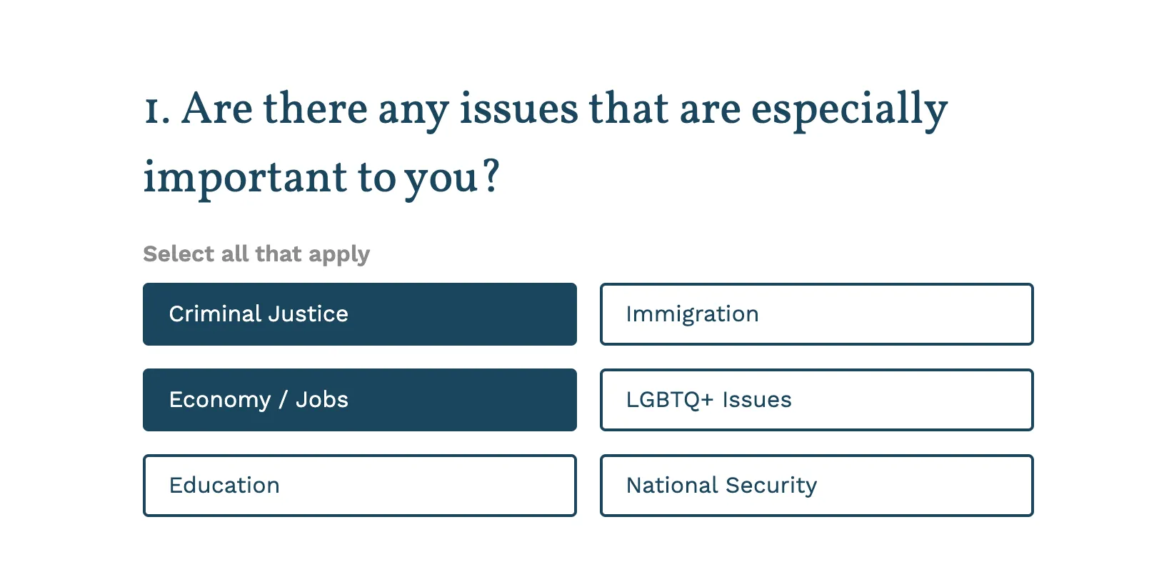
The Next 50 Donor Advising Tool
2020 | thenext50.us/advising
Many people want to give to causes and candidates on the left, but don't know where to spend their money. That's the problem we set out to solve with The Next 50's donor advising tool. Built in React using <a href="/projects/google-sheets-firebase-cms/">Google Sheets and Firebase</a> as a CMS, the tool lets users pick their donation preferences and receive a personalized set of recommended organizations and candidates.
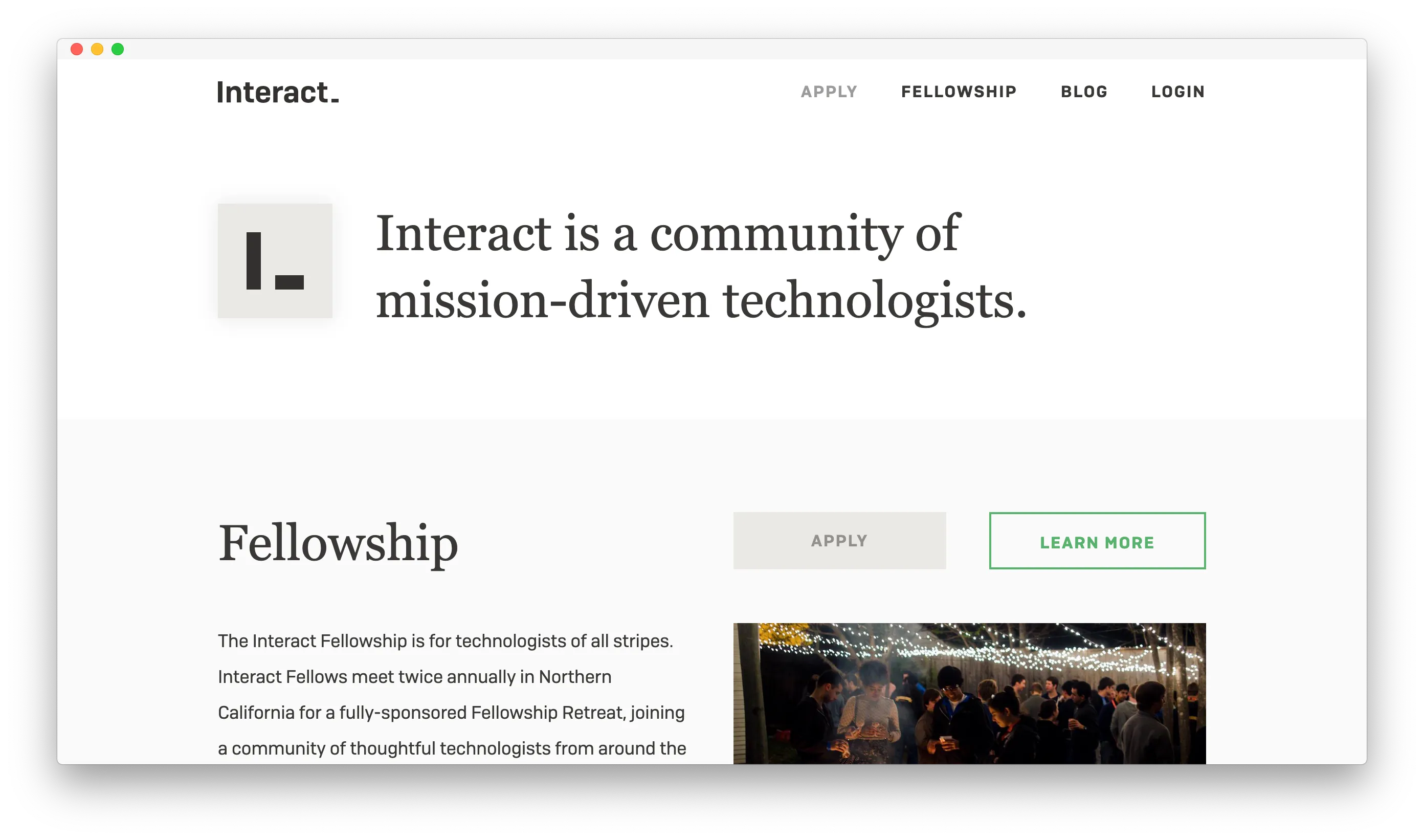
Interact
2020 | joininteract.com
When I rebuilt the Interact website in early 2020, we focused on brining more clarity around the purpose of the organization, its history, and how the Interact fellowship works. This called for a more concrete, appraochable design.
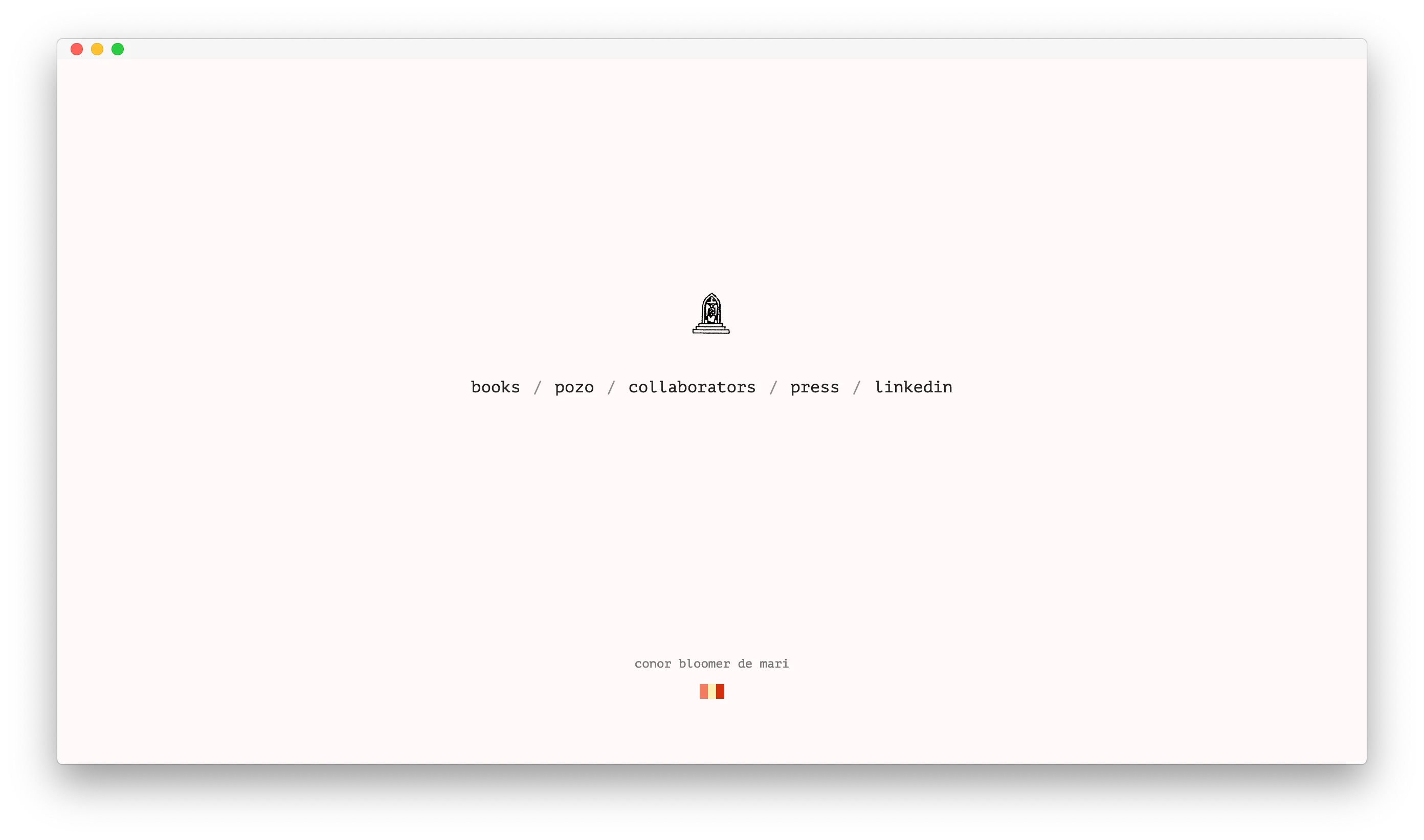
Conor Bloomer
2020 | conorbloomer.com
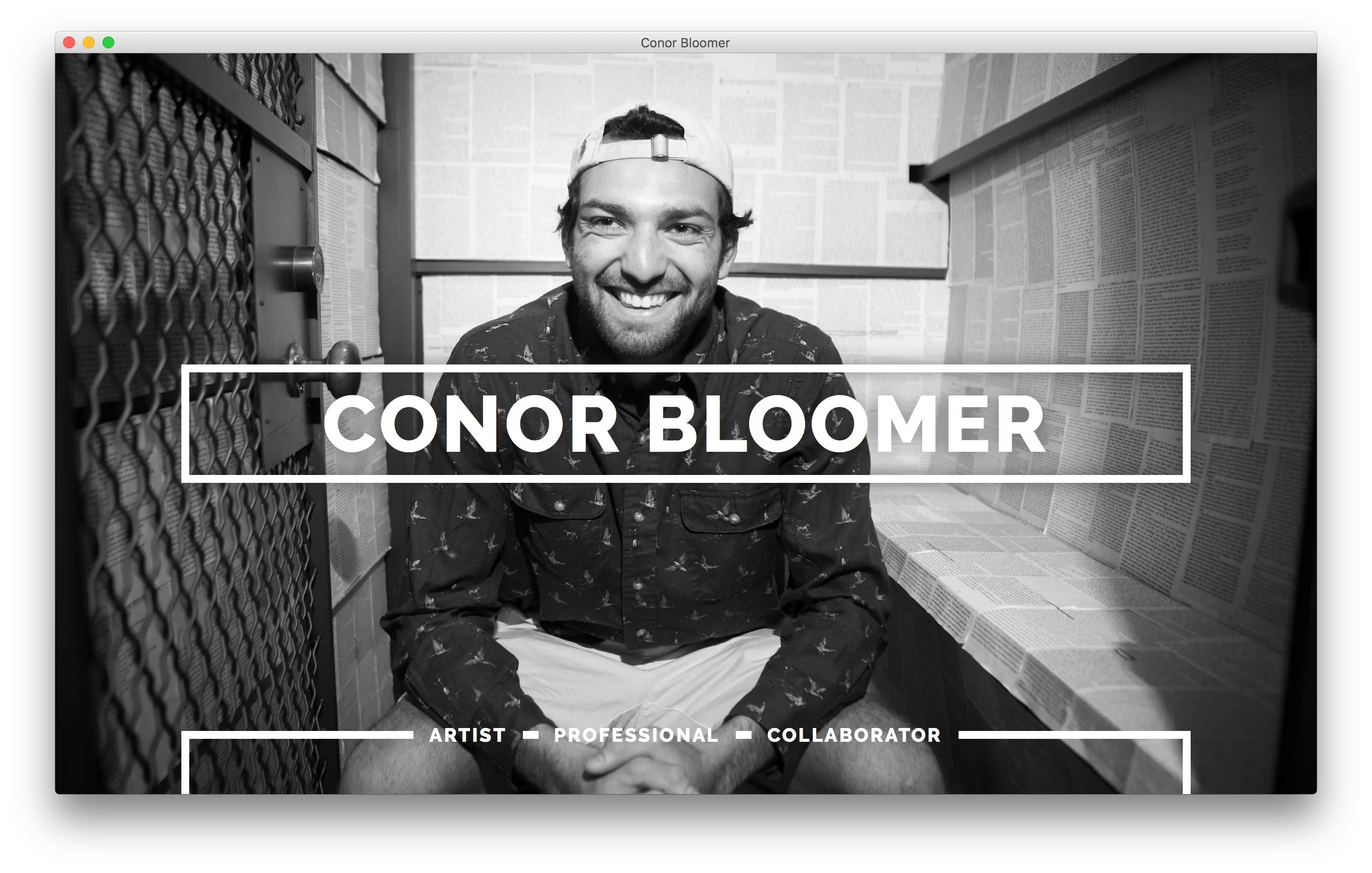
I rebuilt Conor's website to focus on a minimalist artist portfolio, his collaborators, and side interests. The site logo is his design! I really liked getting out of grayscale background colors.
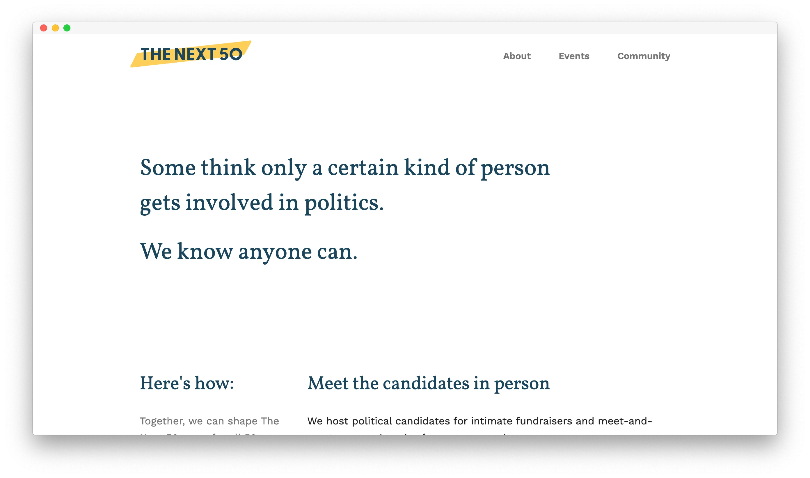
The Next 50
2019 | thenext50.us
I made this website for The Next 50, an organization working to get more young people involved in politics. This site is pretty simple, and uses an animation to introduce itself. I'm really pleased with how well the design scaled from the home page to other pages, and how the bold footer contrasts with the rest of the site.
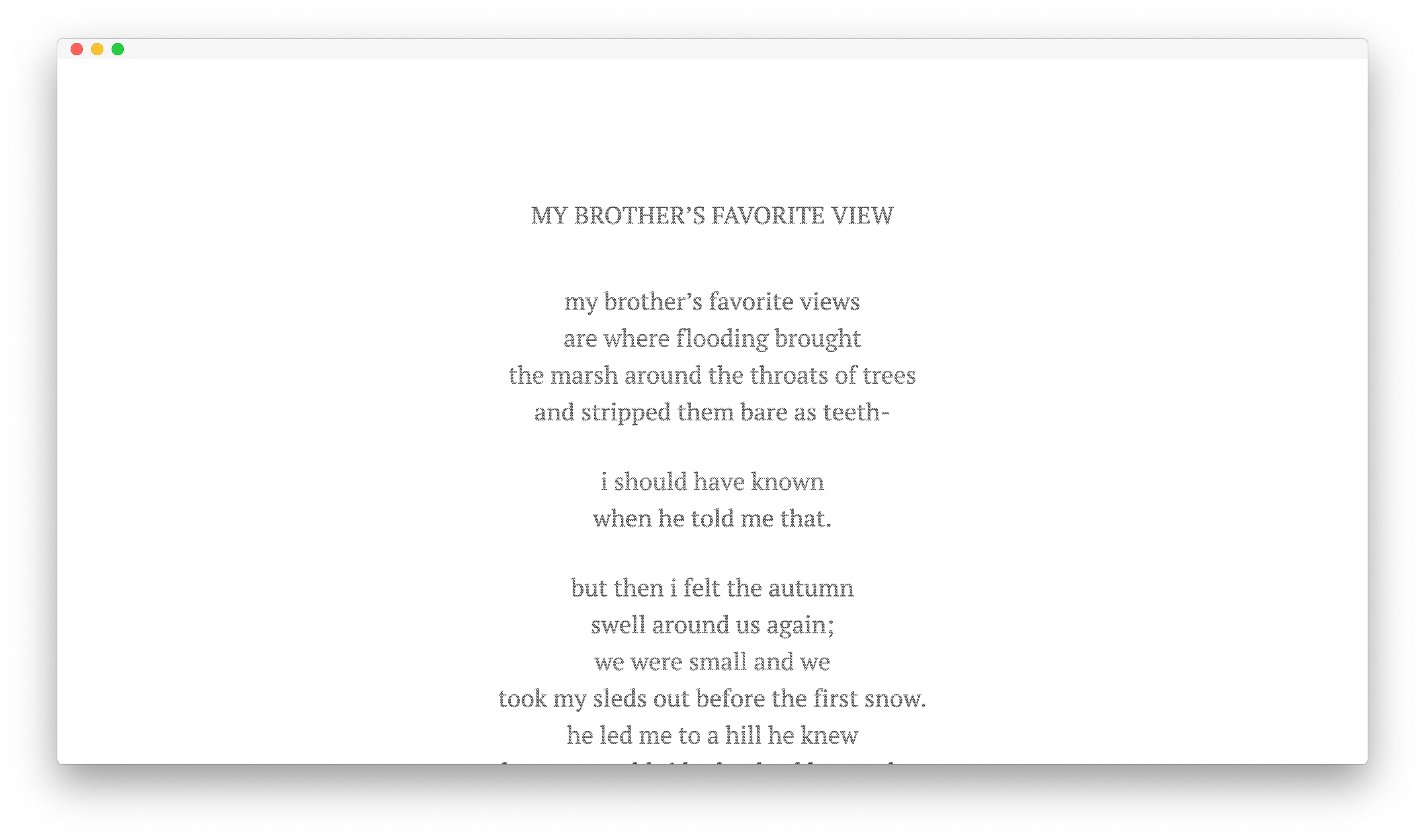
My Brother's Favorite View
2019 | poetry.nathansavoy.com/my-brothers-favorite-view
This ultra-simple treatment of Nathan's poem calls back to an image I have of this poem enscribed by hand onto a wall in pencil. Back in January, I went to Nashville with Nathan to help our friend Conor install an exhibition related to this piece in a gallery at Vanderbilt.
Ashlands
2019 | poetry.nathansavoy.com/ashlands
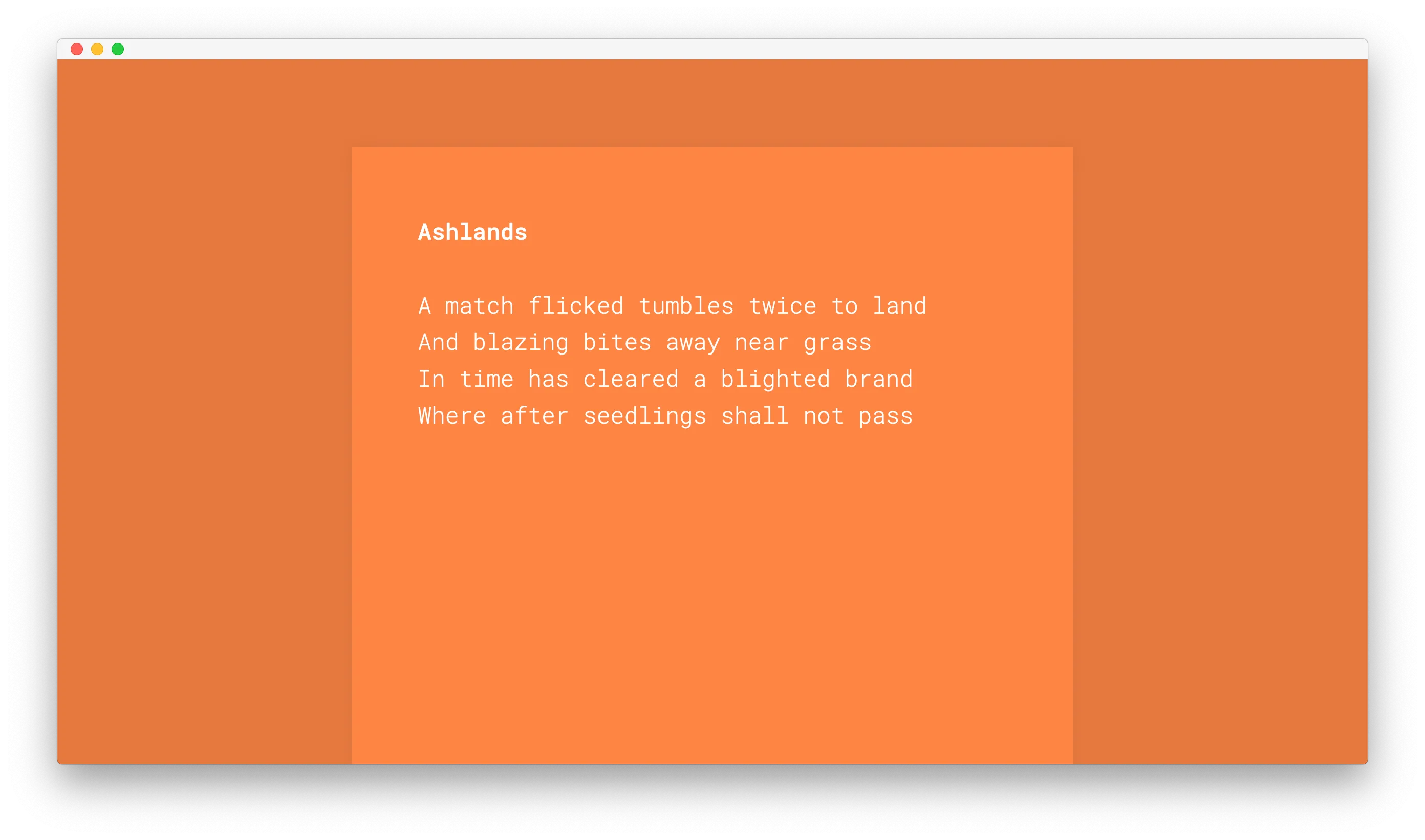
With this poetry collaboration, I wanted to capture the sonic elements of the writing. To do this, I used a series of animations to introduce each word. At the core of the animation is a massive list of animation variables. I used SCSS to transform this data into valid CSS animations. No JavaScript runs on this page.
Mangrove Roots & Otter-play
2019 | poetry.nathansavoy.com/mangrove-roots-otter-play
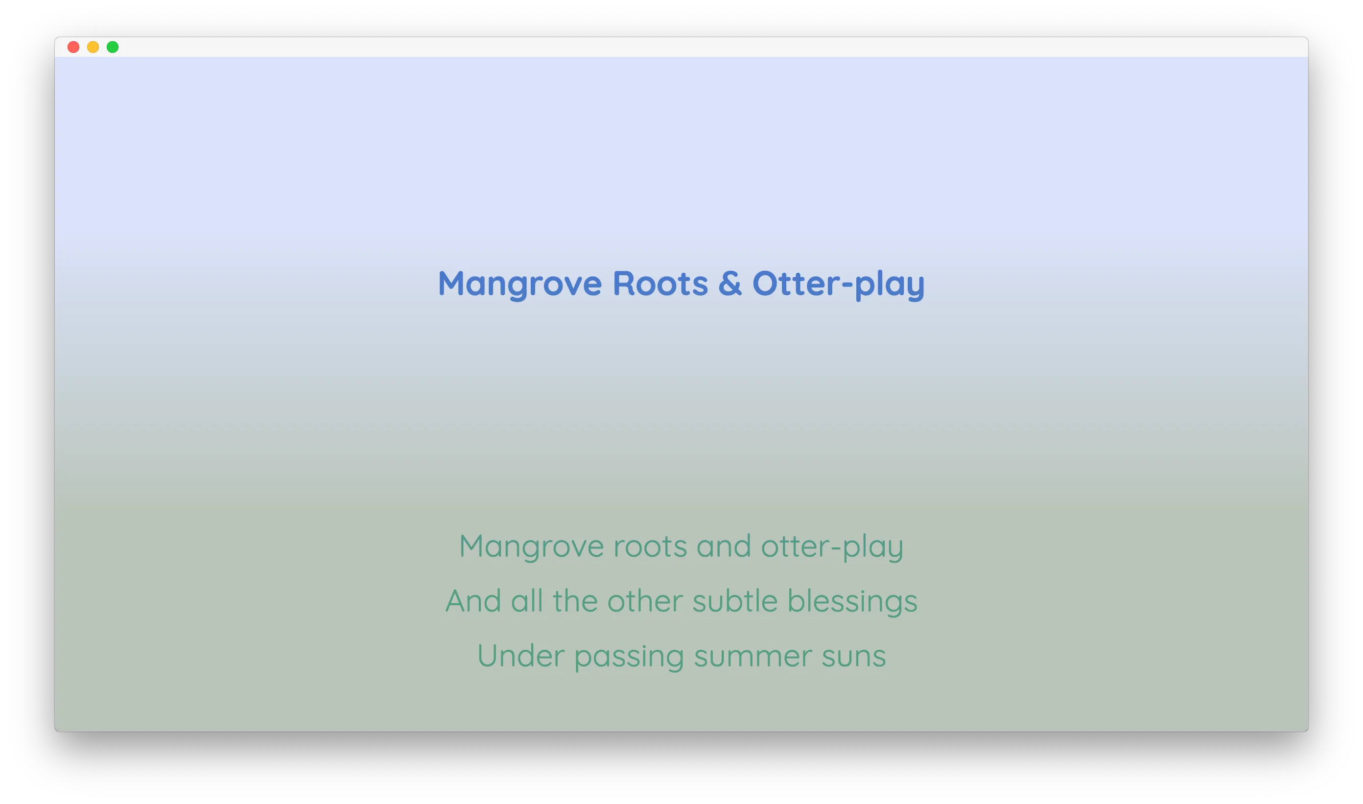
The first of three poems I recently brought to the web as a part of my <a href="https://poetry.nathansavoy.com/">poetry collaboration with Nathan Savoy</a>, this implementation pushes parallax to the max! We really liked the effect of the gradients mashing together. To make it work, I needed eight different copies of the poem in HTML, <code>overflow: hidden</code> on a bunch of containers, and some lightweight JavaScript to control where each is positioned.
David Adewumi
2019 | davidadewumimusic.com
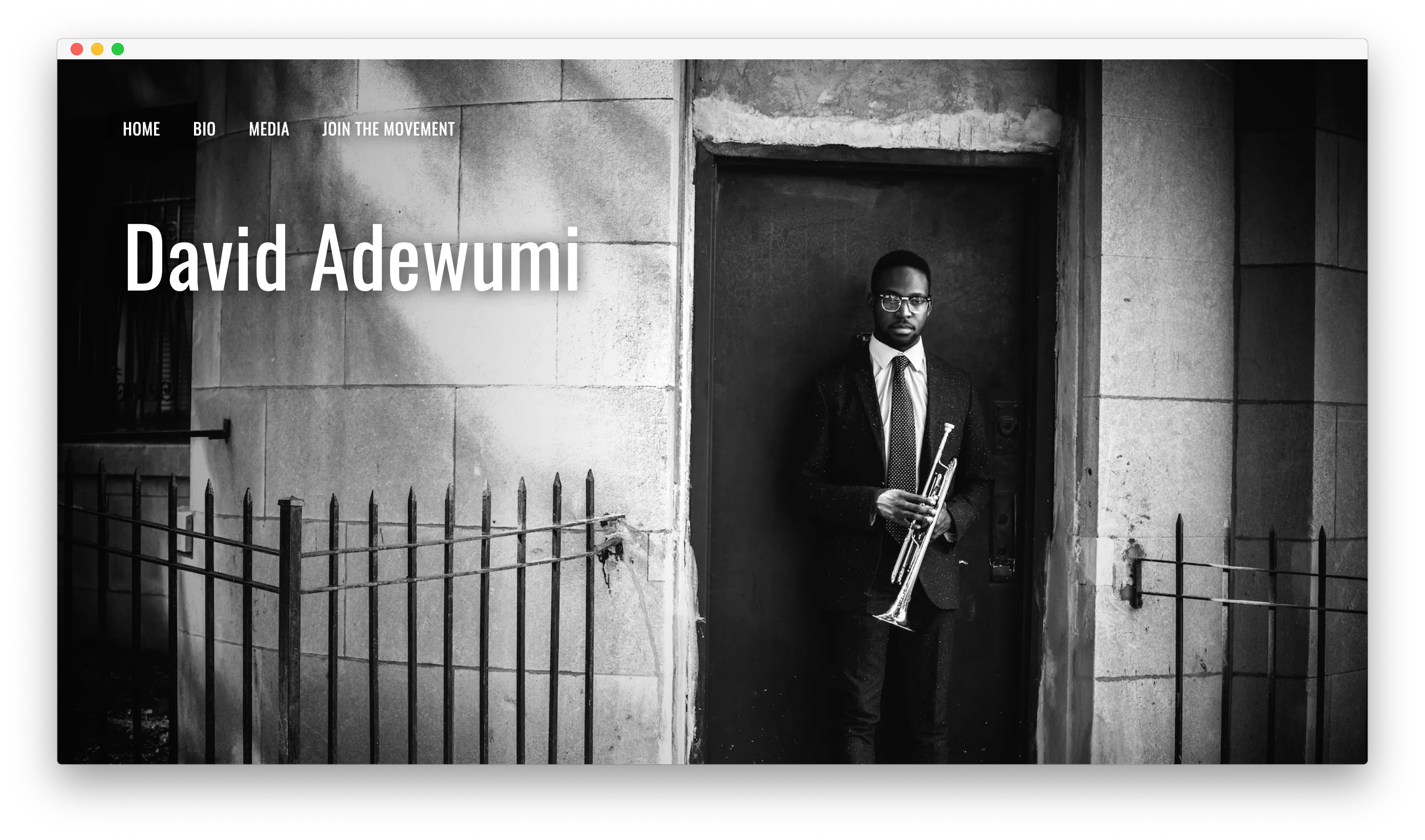
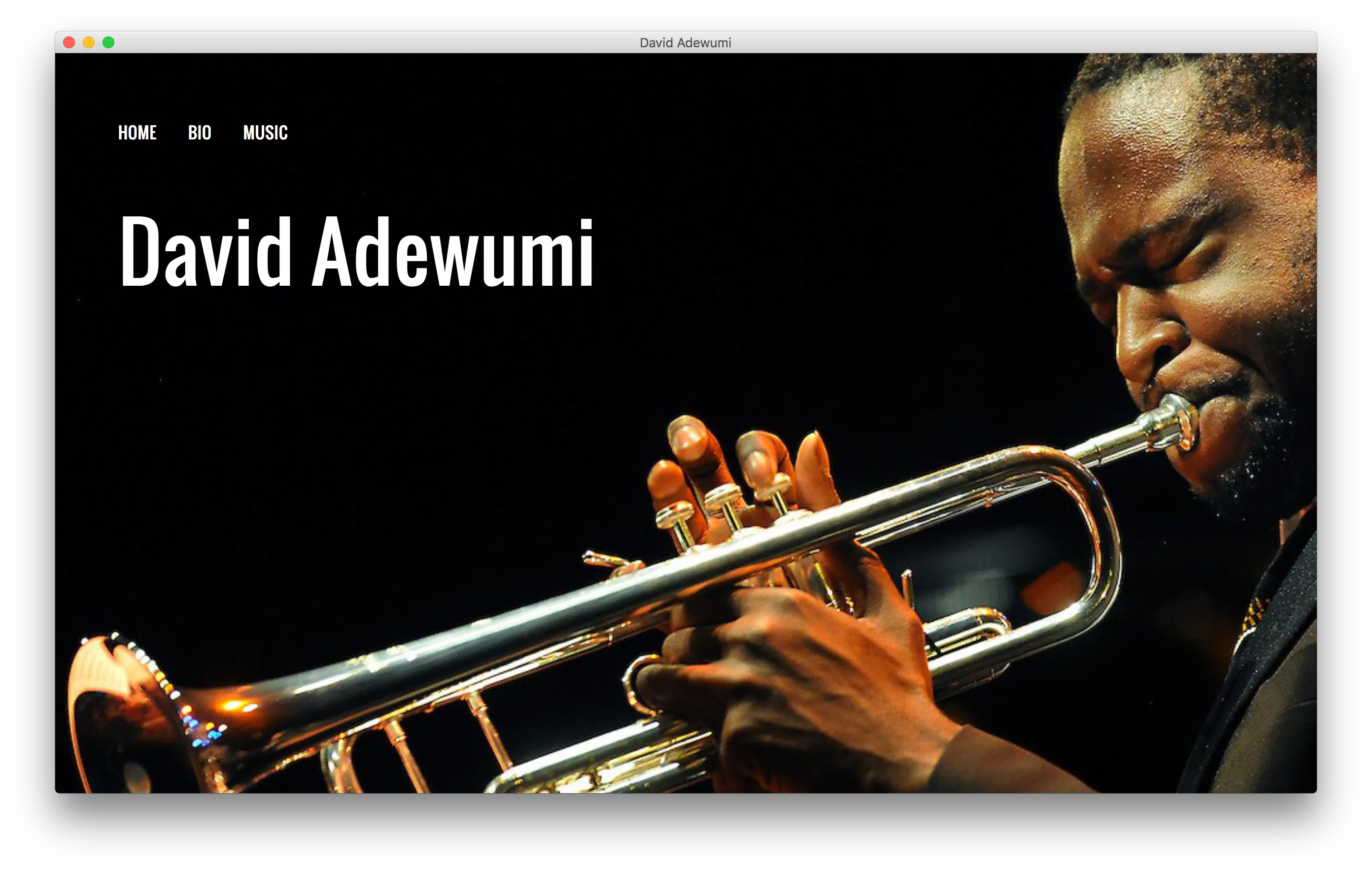
In an update to my <a href="#old-davidadewumimusic-com">design from several years previous</a>, we added new photography, a listserv sign-up, and a couple new pages to David's site. I'm <em>in love</em> with the phogoraphers he works with. It makes it so easy for me!
Onward
2019 | onward.to
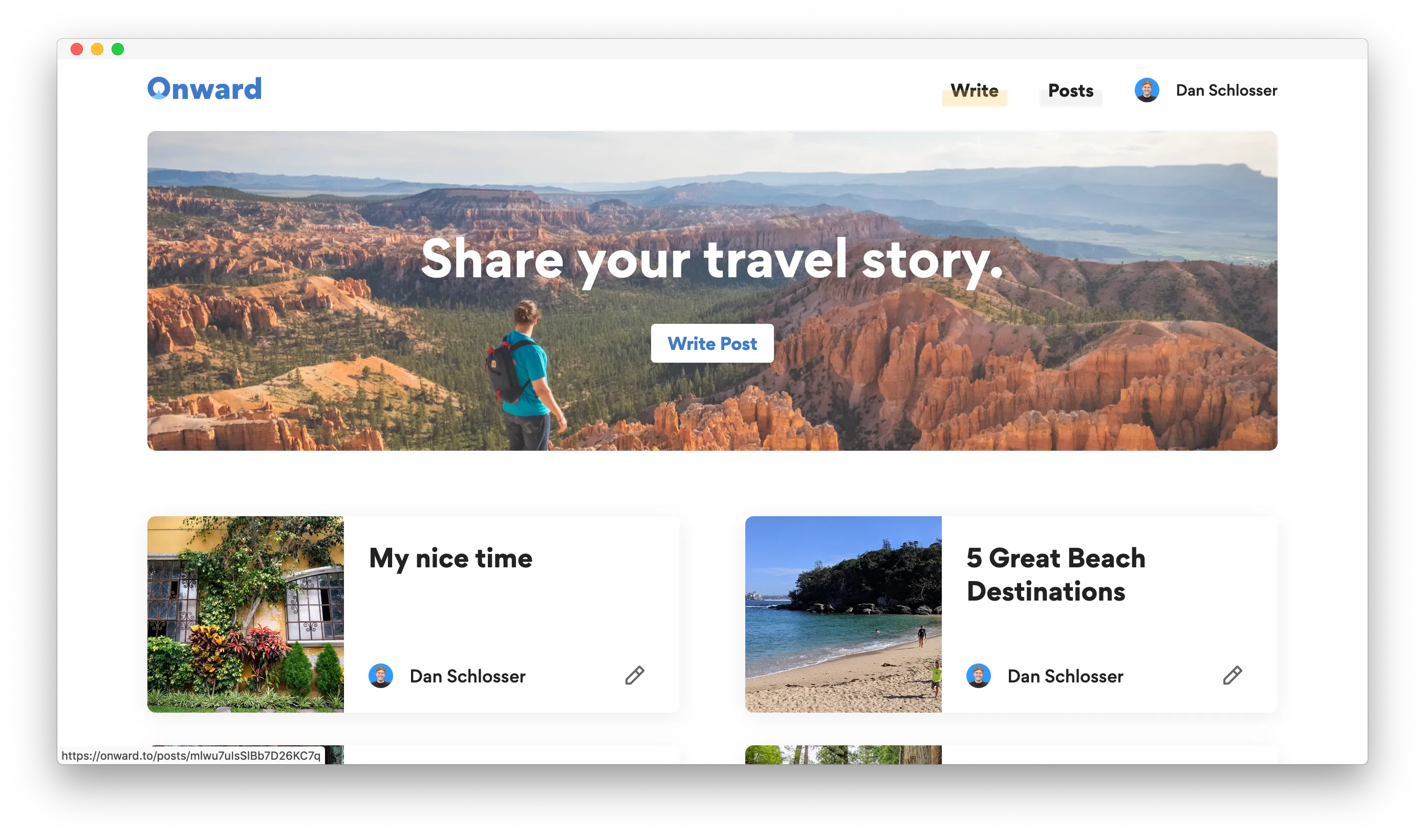
In early 2019, my friend <a href="https://jhil.co">Jeff Hilnbrand</a> and I decided to finally build the side project we had been scheming on for over a year. The result was <a href="https://onward.to">Onward</a>, a travel blogging platform intended for amateurs and pros alike. Check out more in my <a href="/projects/onward">full write-up</a>.
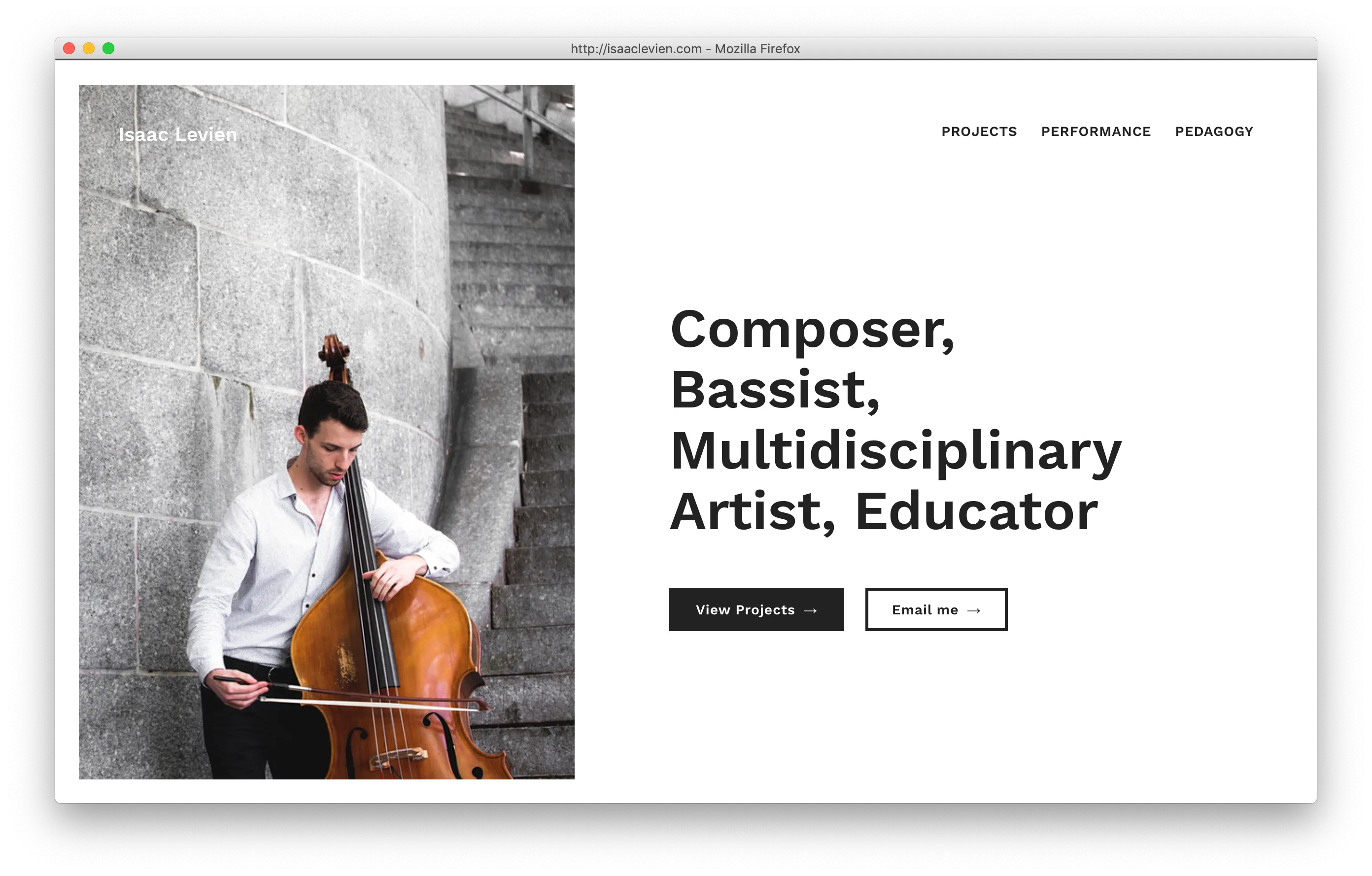
Isaac Levien
2018 | isaaclevien.com
When I redesigned Isaac's personal website, we wanted to make sweeping changes. A modern design and color pallete, beautiful portrait photography, and an updated information architecture: projects, performances, and pedagogy. This was my first website where I feel that I was able to make portrait orientation images really work well with the layout, on desktop and mobile.
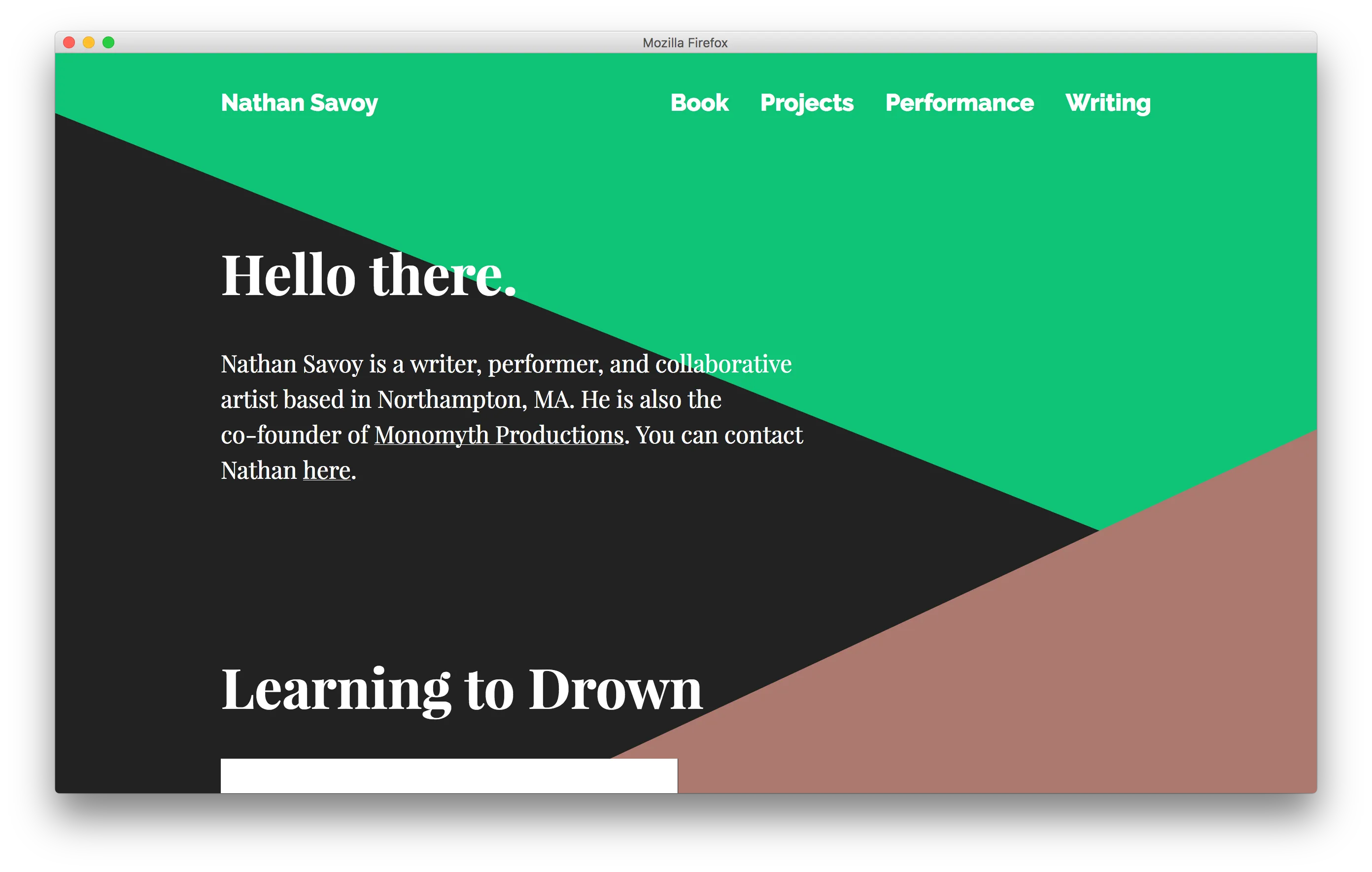
Nathan Savoy
2017 | projects.nathansavoy.com
For this redesign of Nathan's personal website, he wanted to bring a bigger focus to his work. After working through some options, we ended up featuring several pieces of his poetry, photoessays for his collaborative work, and some video. The striking diagonal design was super fun to play with for me, and brought some interesting challenges for responsive design!
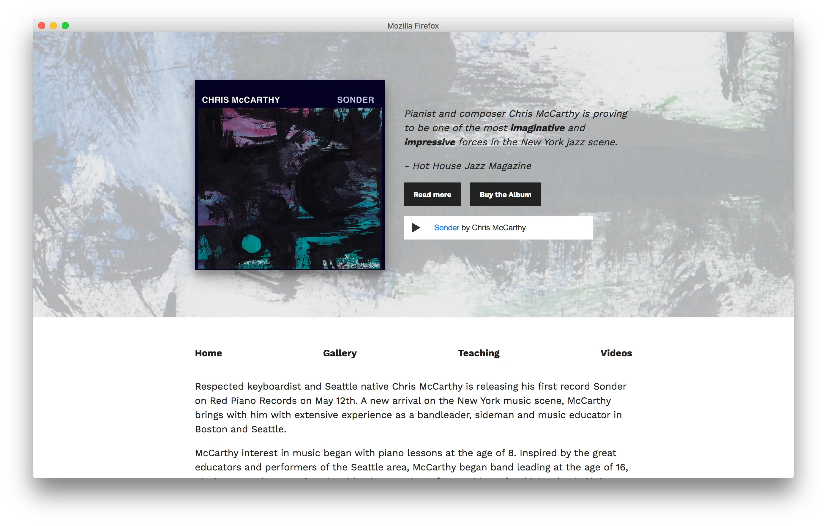
Chris McCarthy
2017 | chrismccarthymusic.com
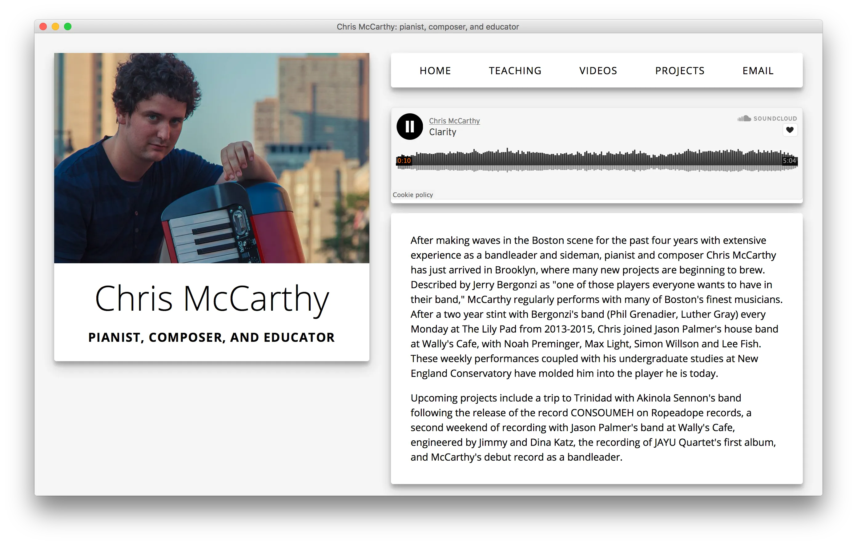
I remade Chris McCarthy's website to promote the release of his first album: <em>Sonder</em>. The first version of this site uses a custom-built router I wrote specifically for the site -- it's an ultra-simple wrapper over the History API, that let us keep the BandCamp embed playing as you click around the site.
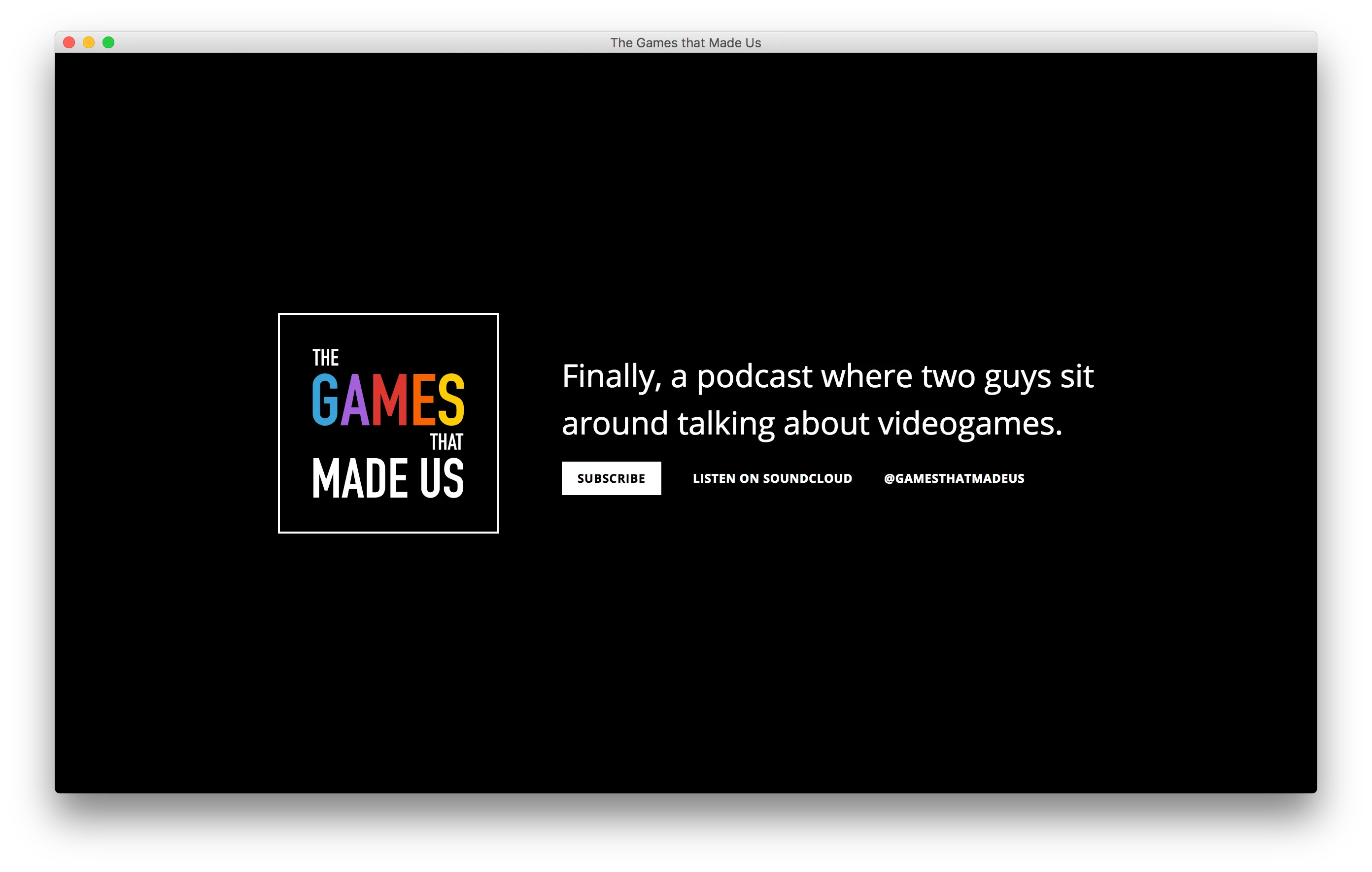
The Games that Made Us
2017 | gamesthatmadeus.com
Another silly one-off site for The Games that Made Us, the podcast I started with my friend Nathan where we talk about the video games we played as kids. I came up with the lead joke while making the site, and we liked it so much it became our defacto tagline.
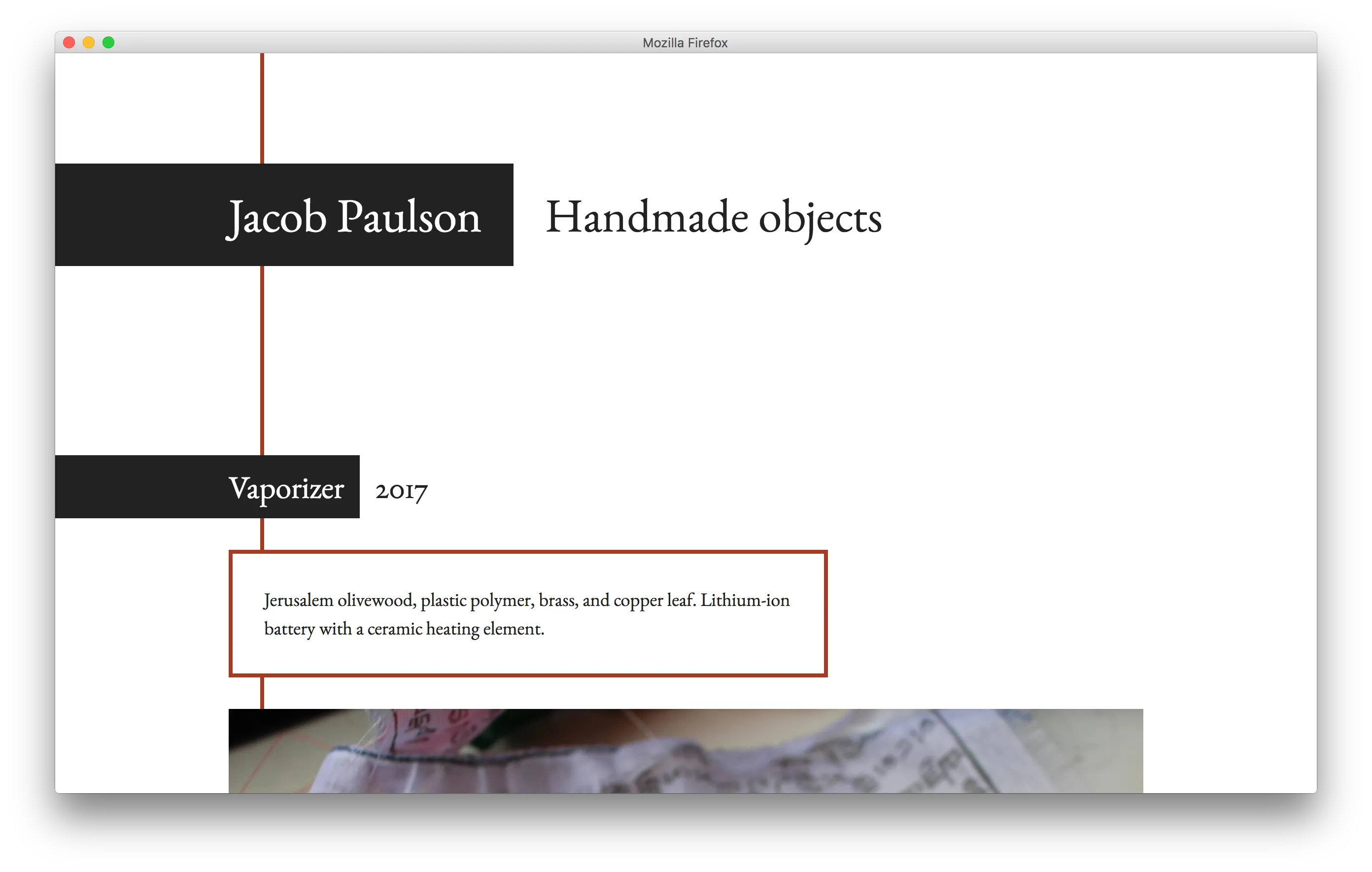
Jacob Paulson
2017 | jacobpaulson.com
I built this portfolio site for my friend Jacob Paulson, who does fantastic restoration, woodworking, and other crafting. He sent me a series of photos of his projects, and I knew they had to take center-stage. On top of being a great craftsman, he's also a great photographer, which made my life easy.
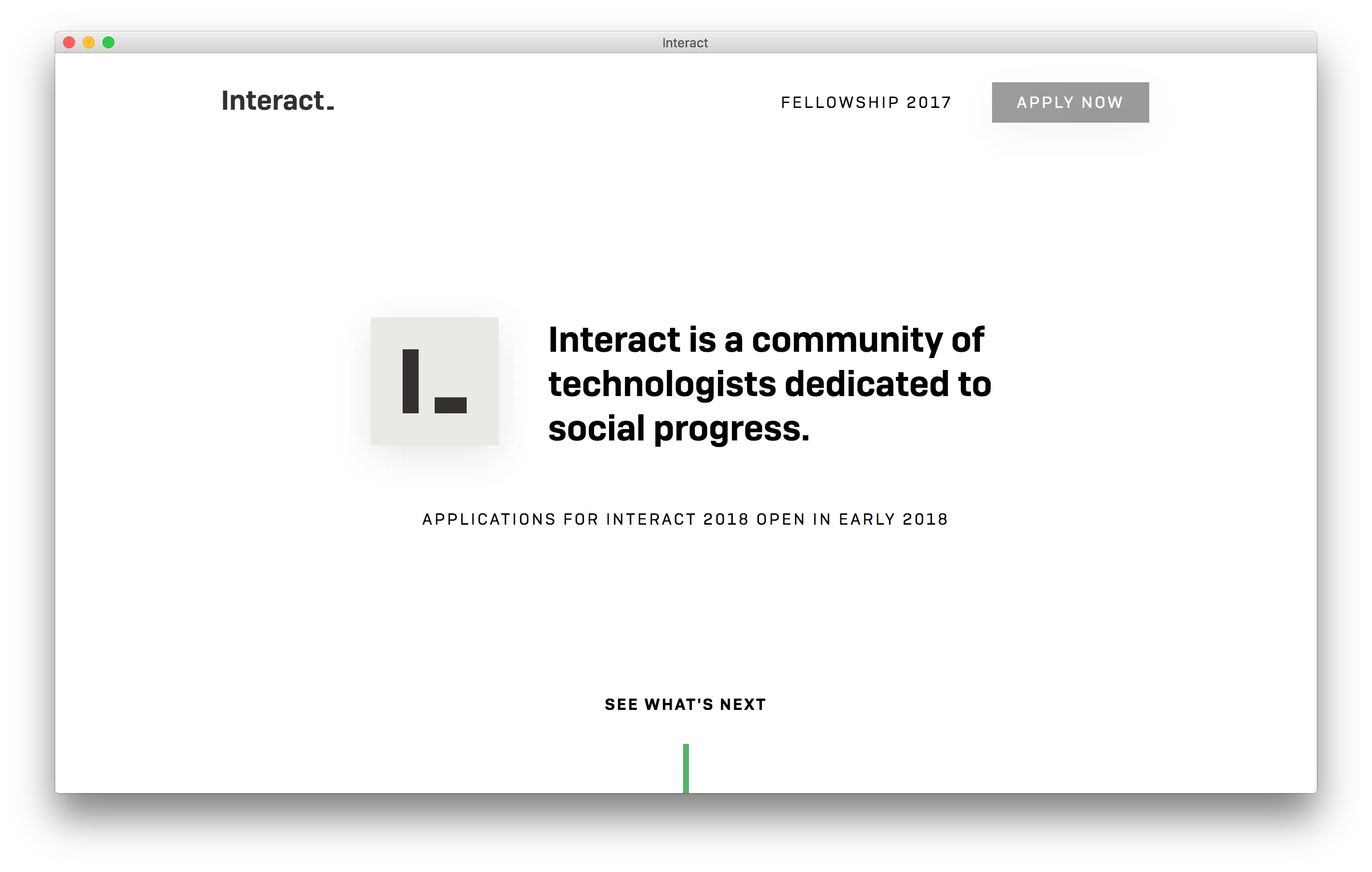
Interact
2017 | joininteract.com
I built the site for Interact, a community of technologists that meet annually for a fellowship retreat. The opening animation was especially fun to make: I was sent an after effects file, and converted it to CSS, a process that was far more successful than I would have imagined.
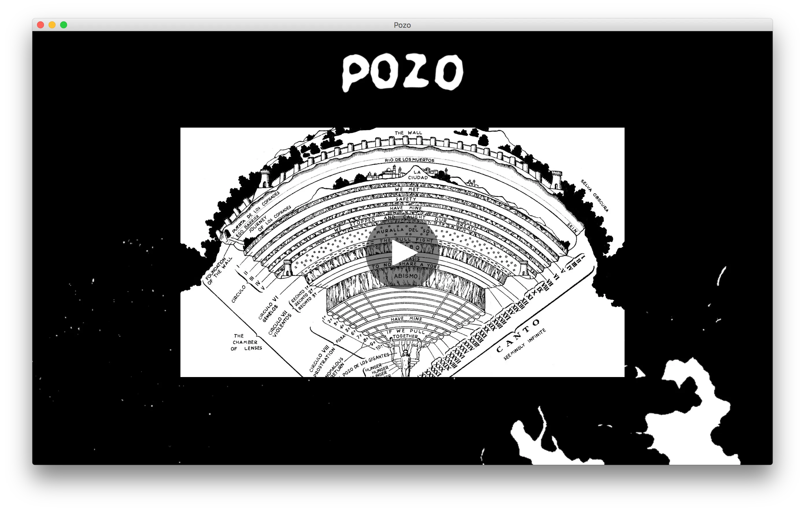
Pozo
2017 | pozodelosgigantes.com
I designed and wrote this site on short notice—about half an hour or so—for my friend Conor Bloomer, for his thesis project, which he called "Pozo de los Gigantes."
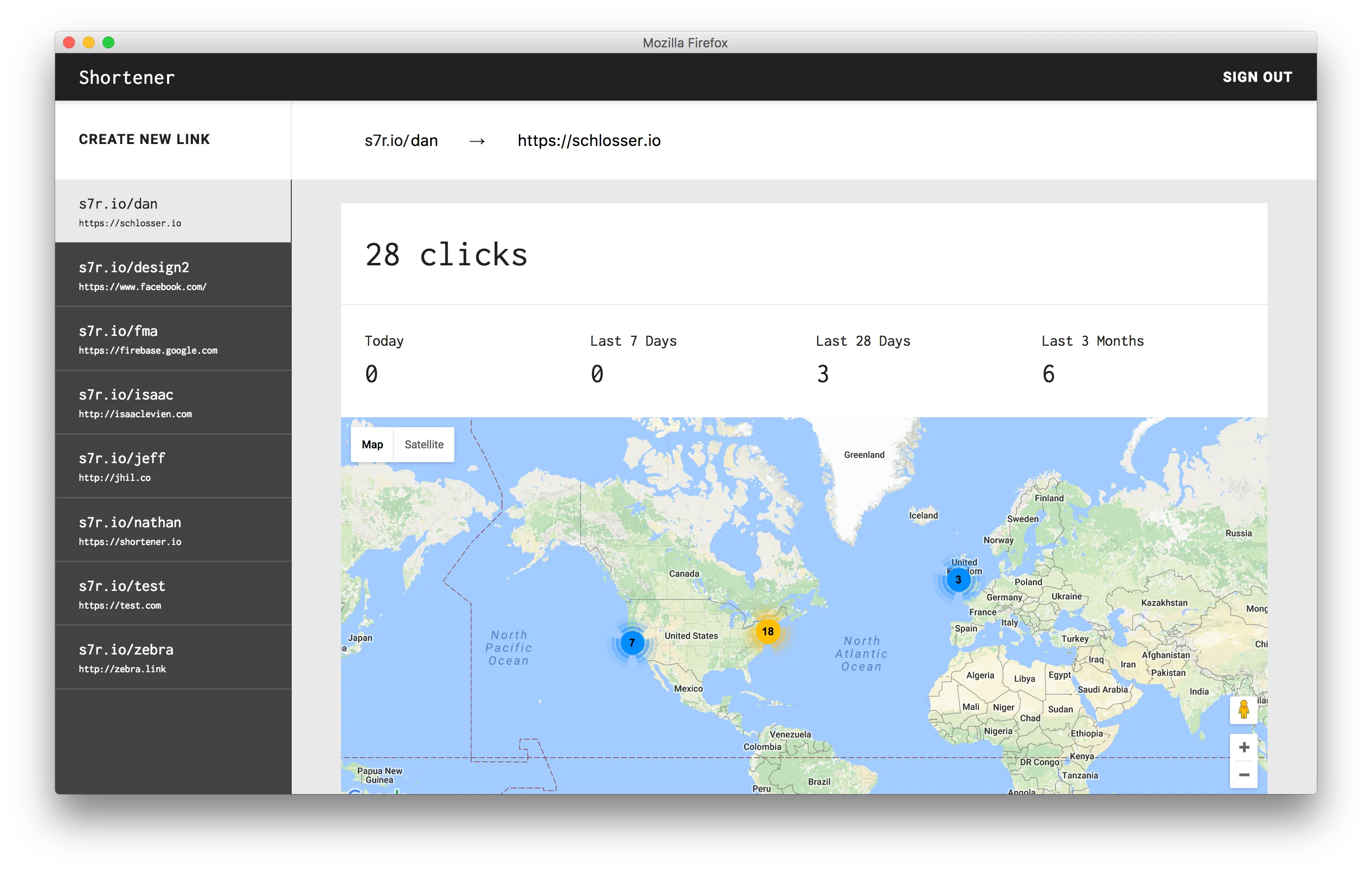
Shortener.io
2017 | shortener.io
This was my first stab at building a React app since it was first announced a few years back. It's a simple web UI for a Firebase backend, but it was a fun challenge to figure out the best practices from the React community. I also spent a bit of time getting it to work with my preferred Gulp build system, but was able to get everything working. The design, on the other hand, is still a work in progress.
David Adewumi (Older site)
2016 | davidadewumimusic.com
I made this website for my friend David Adewumi, a trumpet player who graduated from New England Conservatory and is now studying at The Juliard School. When I saw this picture of Dave, I knew that it could drive the design all by itself.
Minimill
2016 | minimill.co
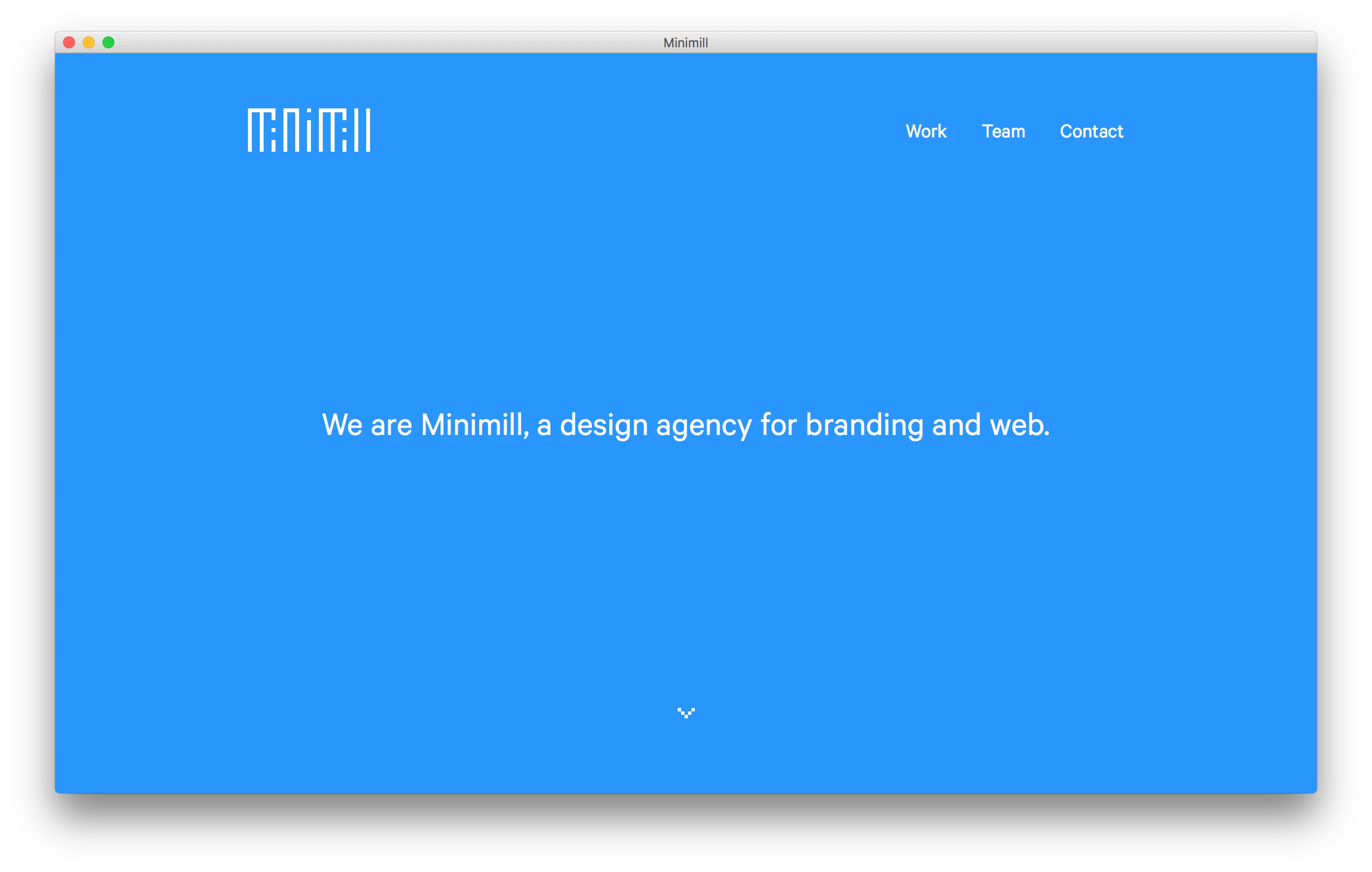
This is the website for <a href="/teams/minimill">Minimill</a>, a design agency that I started with <a href="http://jhil.co">Jeff Hilnbrand</a>. We spent a long time designing and engineering the site to be smooth, simple, and beautiful. I used my own <a href="https://github.com/minimill/pangea.js/">pangea.js</a>, alongside custom JavaScript to achieve this effect.
Nathan Savoy
2016 | nathansavoy.com
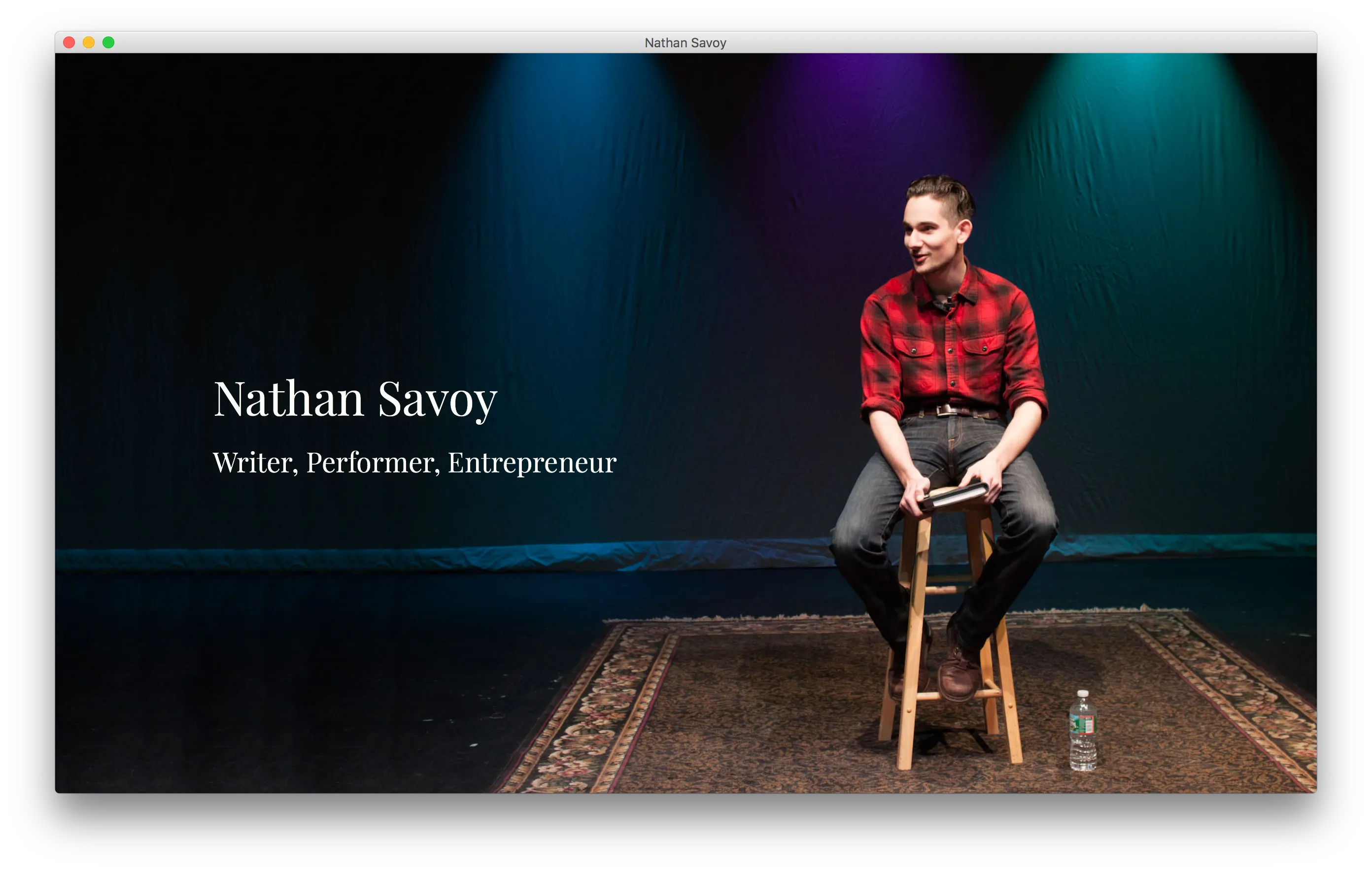
I made this website for Nathan Savoy, a writer, performer, and entrepreneur living in Massachusetts. We collaborated on several other projects as well, which are also included on his portfolio page. I think the pure CSS parallax effect fits the site really well.
Love is Not a Peer Review
2016 | poetry.nathansavoy.com/love-is-not-a-peer-review/
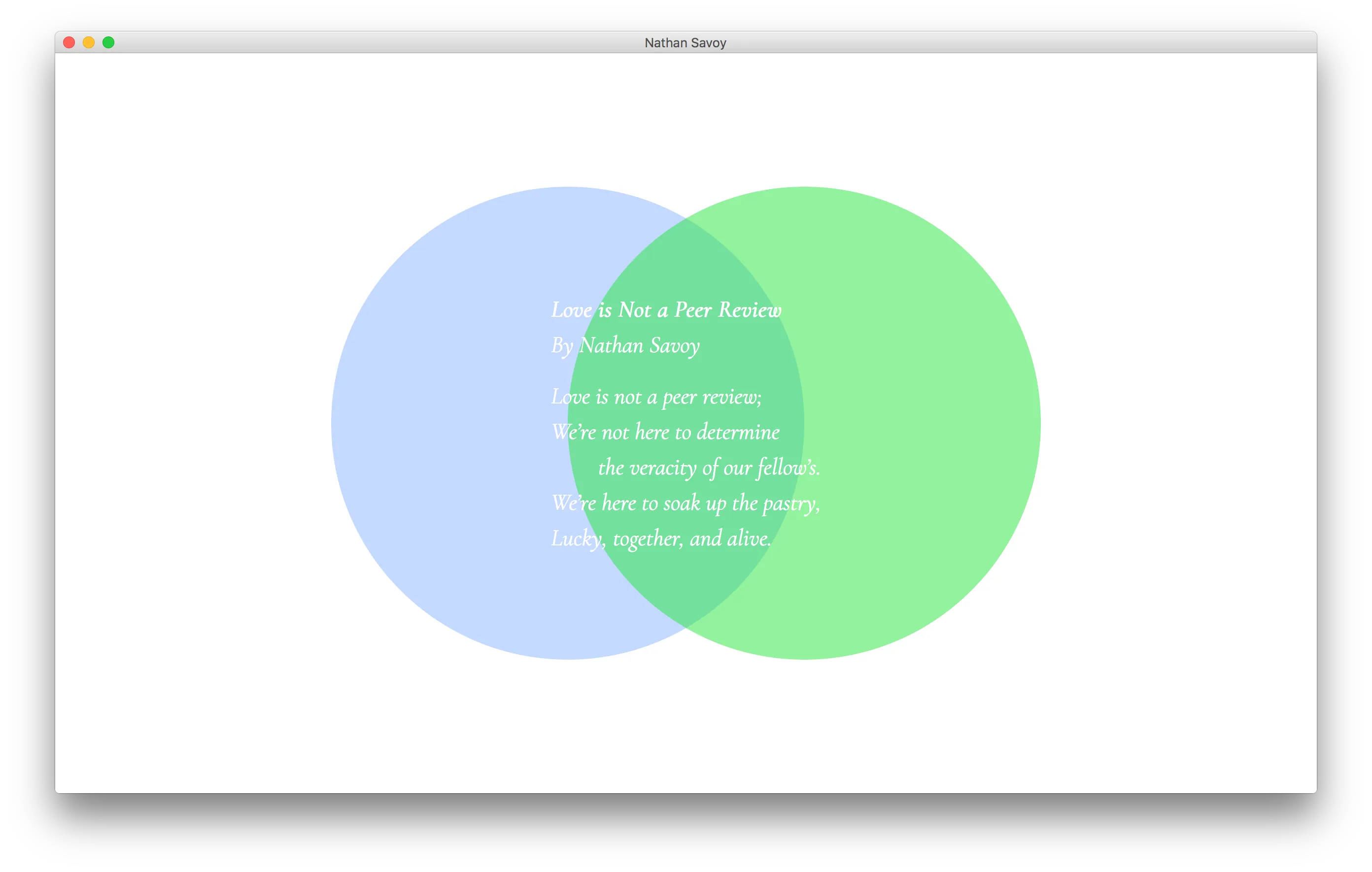
I collaborated with <a href="http://nathansavoy.com/">Nathan Savoy</a> to bring his poem to web. What I enjoyed most about this project was that my reading of the poem (which drove my design) was very different than his. That difference in interpretation adds a lot to the page, I feel.
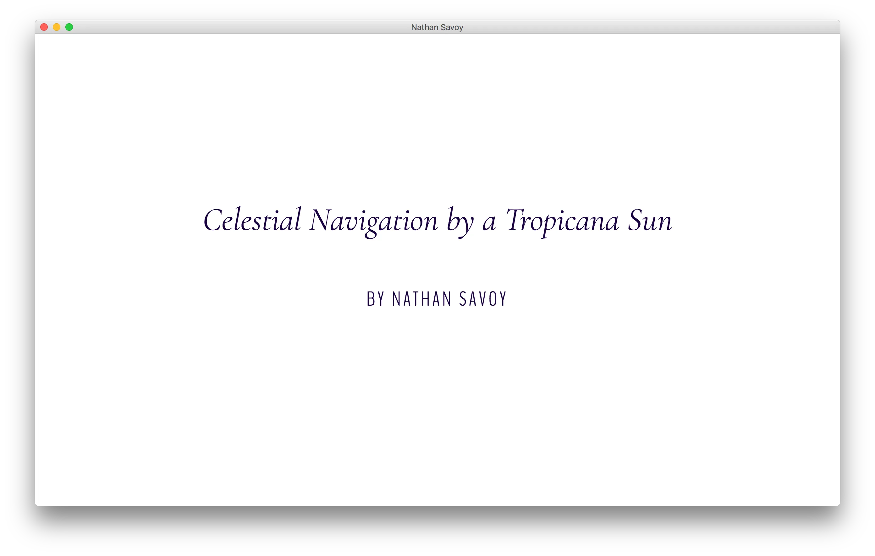
Celestial Navigation by a Tropicana Sun
2016 | poetry.nathansavoy.com/celestial-navigation-by-a-tropicana-sun/
This is another site I made in collaboration with <a href="http://nathansavoy.com/">Nathan Savoy</a>. In my interpretation of the poem, I worked extensively on flexing my typographic muscles. (They're under-used by most accounts, but it was a good learning experience.)
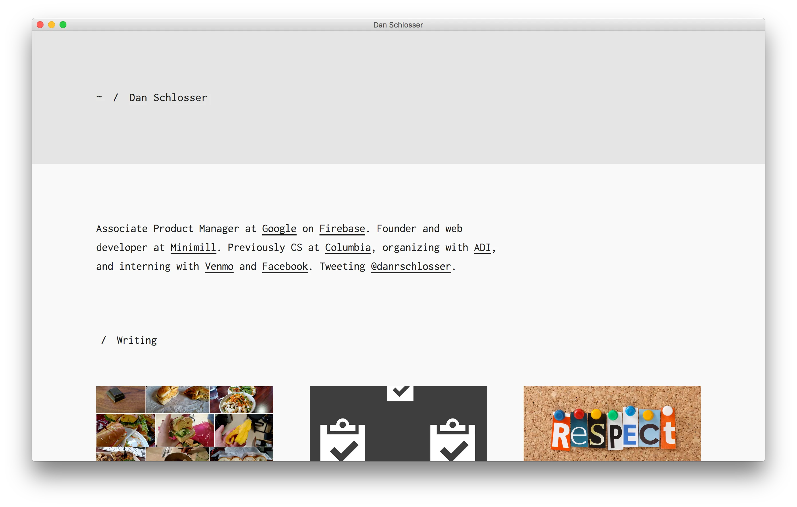
My Personal Website (2016)
2016 | schlosser.io
This is the website you're using right now! My eternal pet project, and a guinea pig for a new version of my <a href="/projects/minimill-project-template/">project template</a> that uses Jekyll and a progressive / responsive image loader. The build system performs significant image pre-processing to make the site run smoothly.
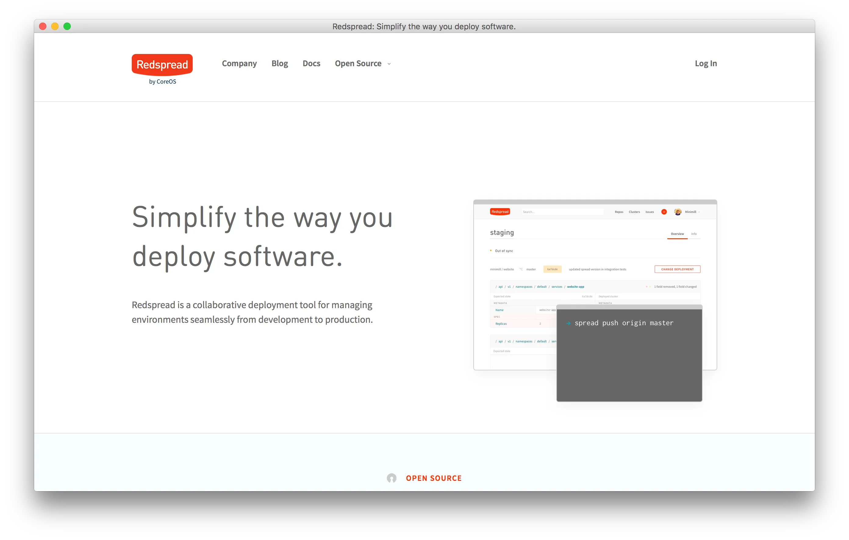
Redspread Marketing Site
2016 | redspread.com
Redspread came to <a href="/teams/minimill/">Minimill</a> looking for a more mature landing page for their Docker configuration as a service startup. We published a <a href="https://minimill.co/redspread/">case study</a> on our work with Redspread, which includes more details on our process.
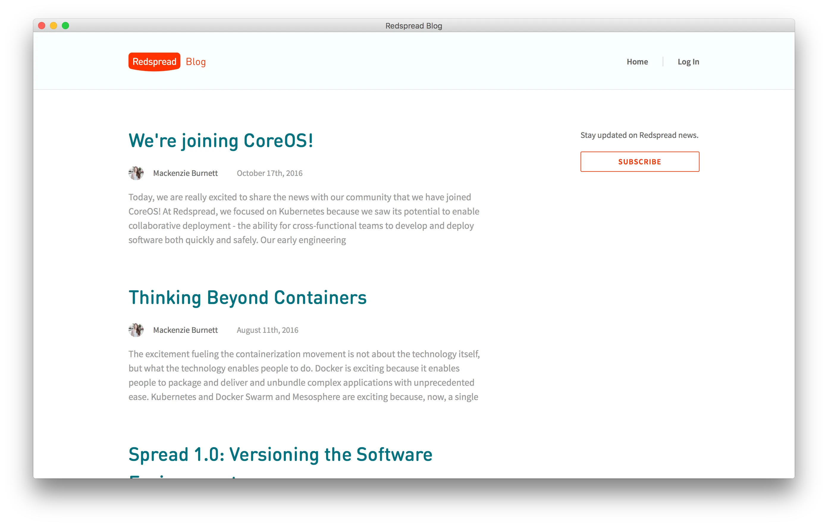
Redspread Blog
2016 | blog.redspread.com
In addition to working on their marketing site and webapp, Redspread also asked Minimill to develop a skin for their blog, which was self-hosted using <a href="https://ghost.org/">Ghost</a>, an open-source CMS. I love how the header is achieved with just a subtle background-color change.
Chris McCarthy Music
2016 | chrismccarthymusic.com
I made this personal website / portfolio page for Chris McCarthy, a pianist, composer, and teacher living in New York City. I reused a simple CMS I wrote for an earlier project to allow him to edit pages as needed.
Conor Bloomer
2016 | conorbloomer.com
I made this minimalist portfolio page for Conor Bloomer, a recent graduate from Vanderbilt University with a degree in Studio Arts, and focused studies in finance and medicine.
Feeding Dan in 2015
2016 | feeding.schlosser.io
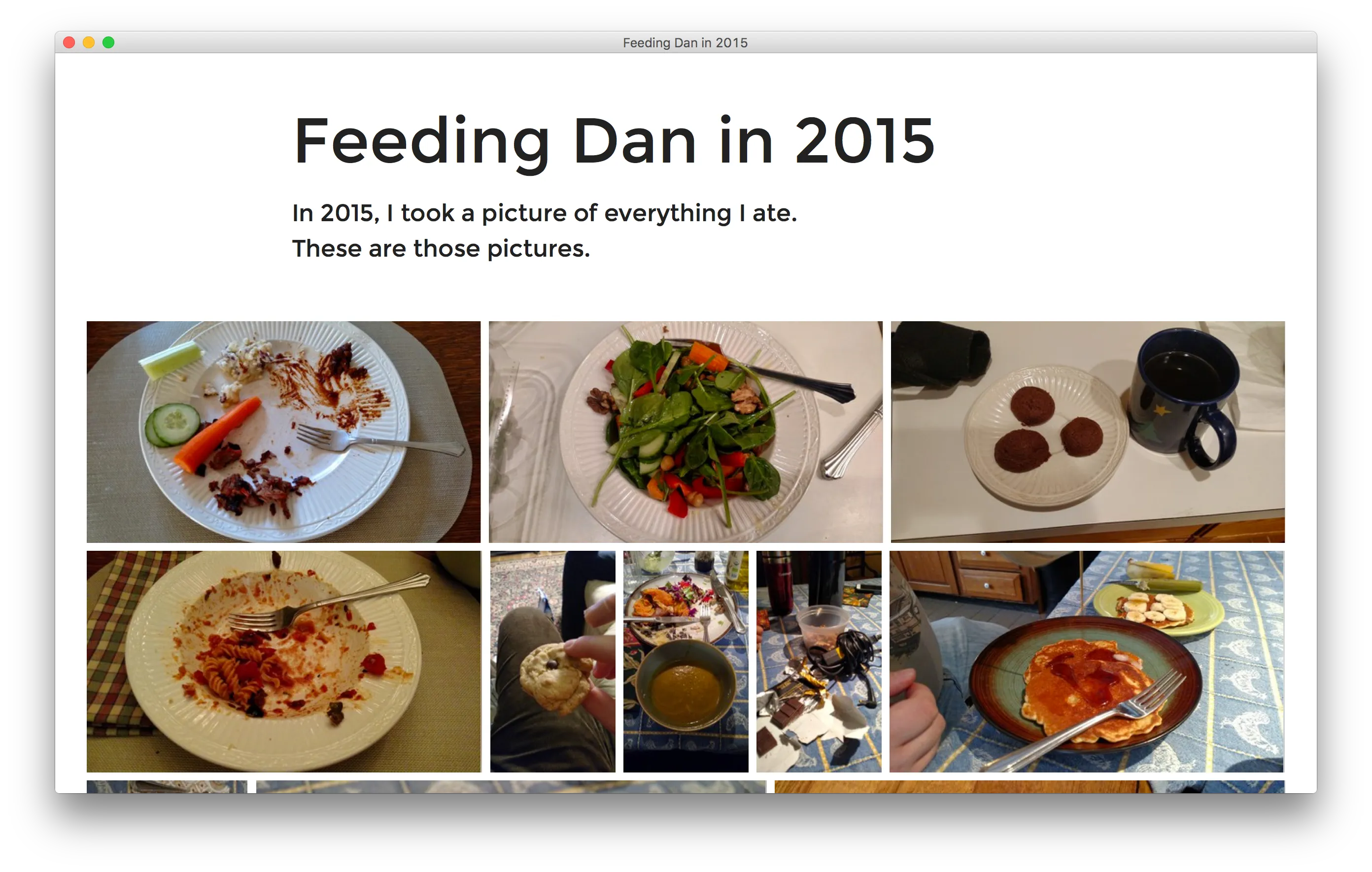
In 2015, I took a picture of everything I ate. And I do mean everything! To commemorate the year, I made a website with every food picture I took that year, using a <a href="/projects/pig-js/">custom-built image grid inspired by Google Photos.</a> I also wrote <a href="/writing/building-the-image-grid-from-google-photos/">an article</a> describing how it works.
CUBE
2016 | cube.schlosser.io
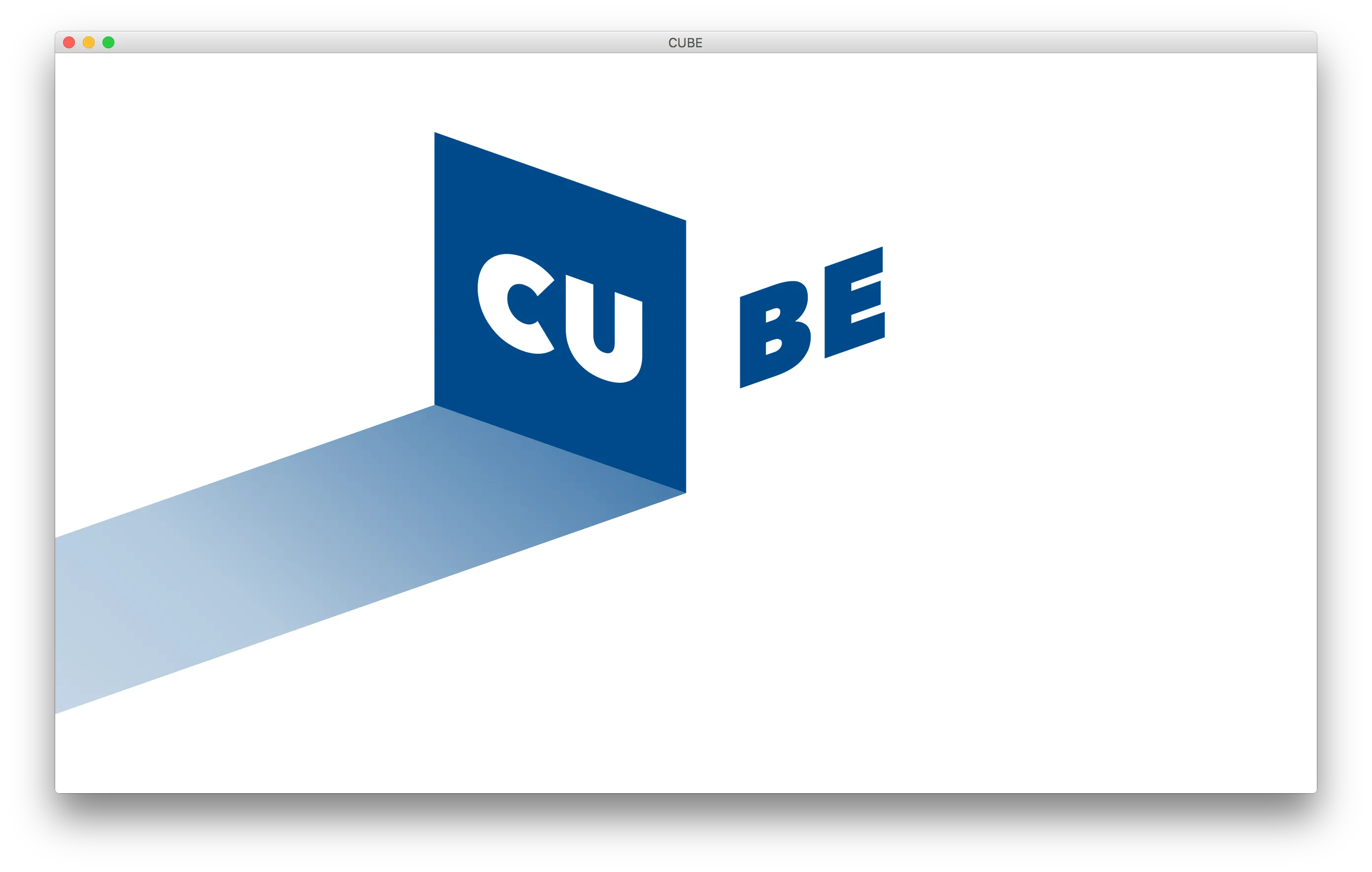
I made this fun, interactive splash page for Professor R.A. Farrokhnia, the executive director of CUBE, a new graduate program being developed at Columbia Engineering. My favorite part of this site is the call to action, which is intended to be <em>hidden</em> from users! I'm sure you'll be able to find it…
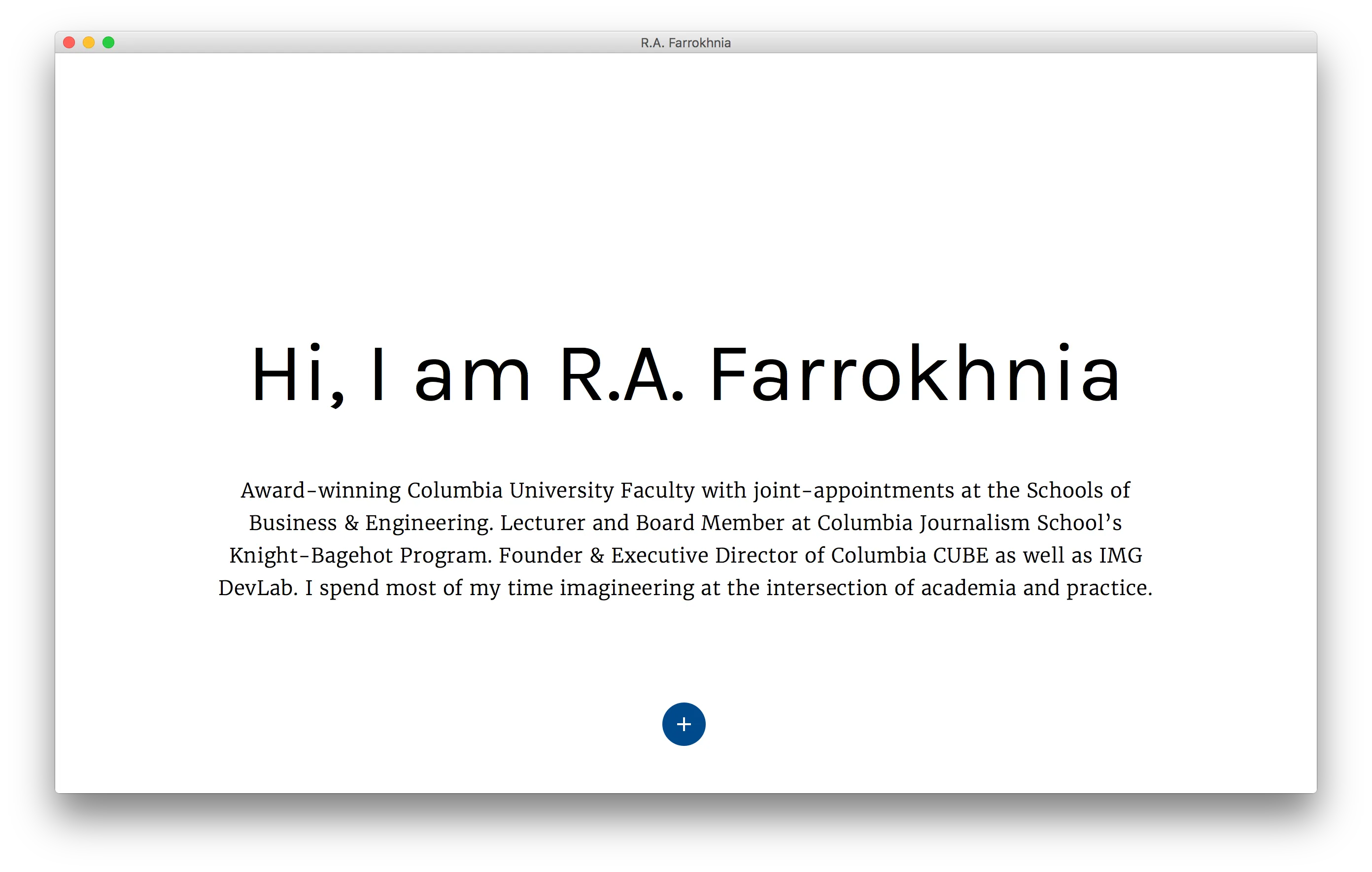
R.A. Farrokhnia
2016 | farrokhnia.com/
I also helped Professor Farrokhnia with a new version of his personal website. While the design is not mine, I added <a href="https://github.com/minimill/pangea.js">pangea.js</a>, an animation framework I authored, to add animations between each pair of pages.
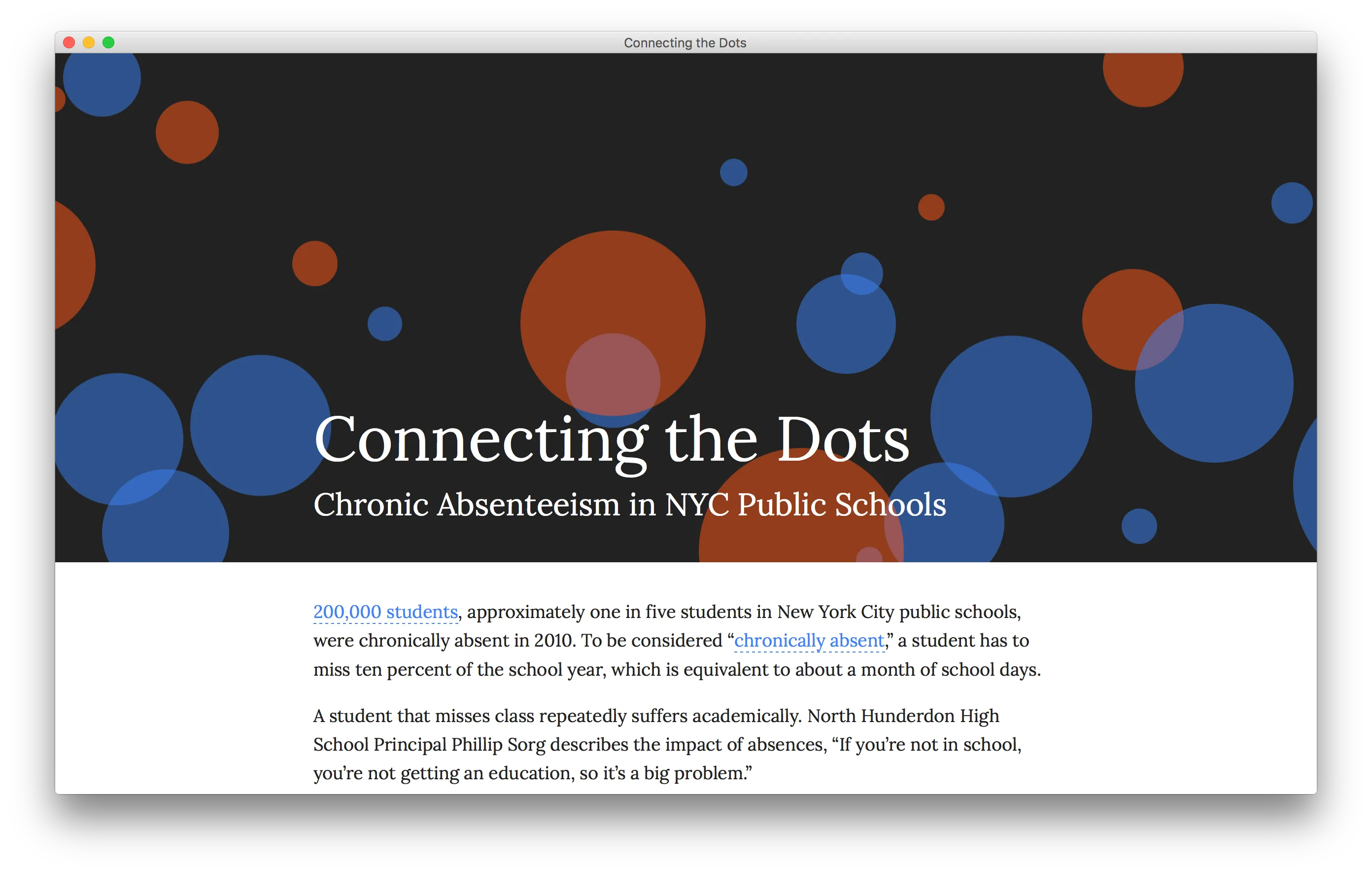
Connecting the Dots: Chronic Absenteeism in NYC Public Schools
2016 | absent.schlosser.io
This site was part of a final project for a course I took at Columbia entitled Storytelling and Streaming Data. I was part of a group of five that researched chronic absenteeism in New York City Public Schools. The parallax header and graphics are pure HTML & CSS.
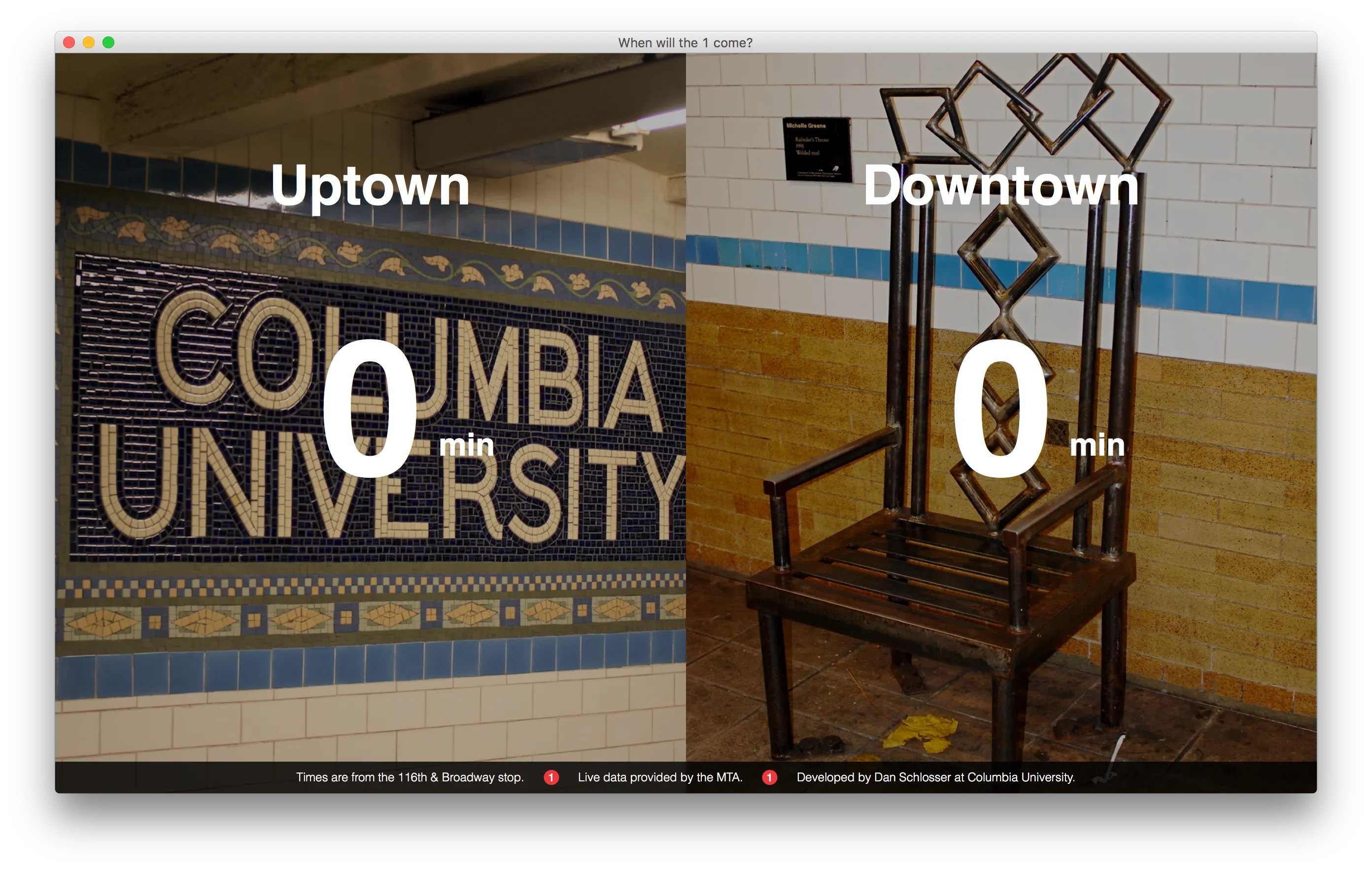
When Will the 1 Come
2016 | whenwillthe1come.schlosser.io
I made this websites as assignment in a course at Columbia called Storytelling and Streaming Data. This simple app uses the NYC MTA streaming schedule data to display how many minutes you have to wait to get the 1 train at 116 and Broadway (Columbia's local stop).
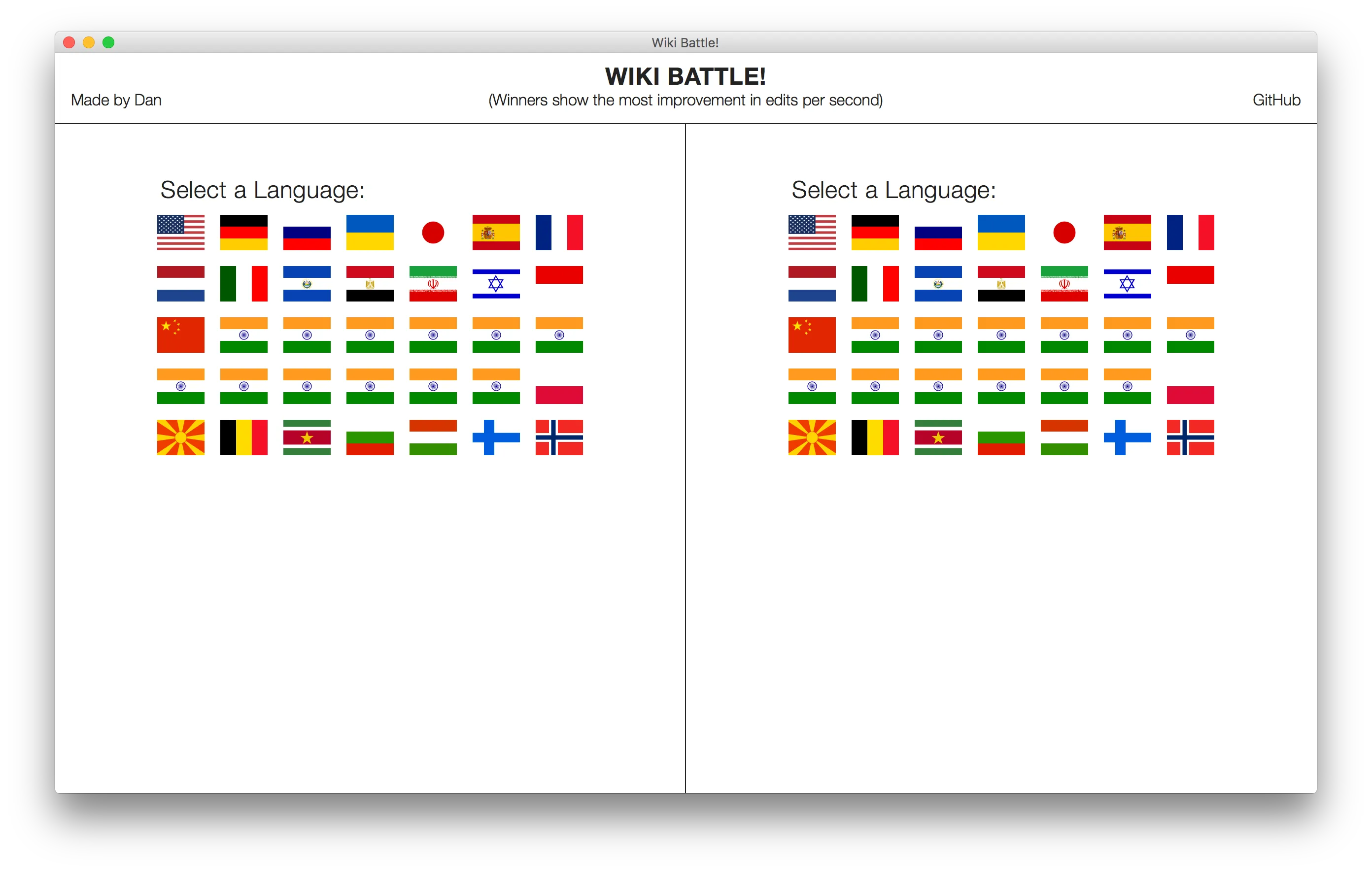
Wiki Battle
2016 | battle.schlosser.io
Made as a project for my Storytelling and Streaming Data class at Columbia, this project pits two languages against each other to compete over which one has more edit activity on Wikipedia at the moment. The score is determined as the change in edits per second.
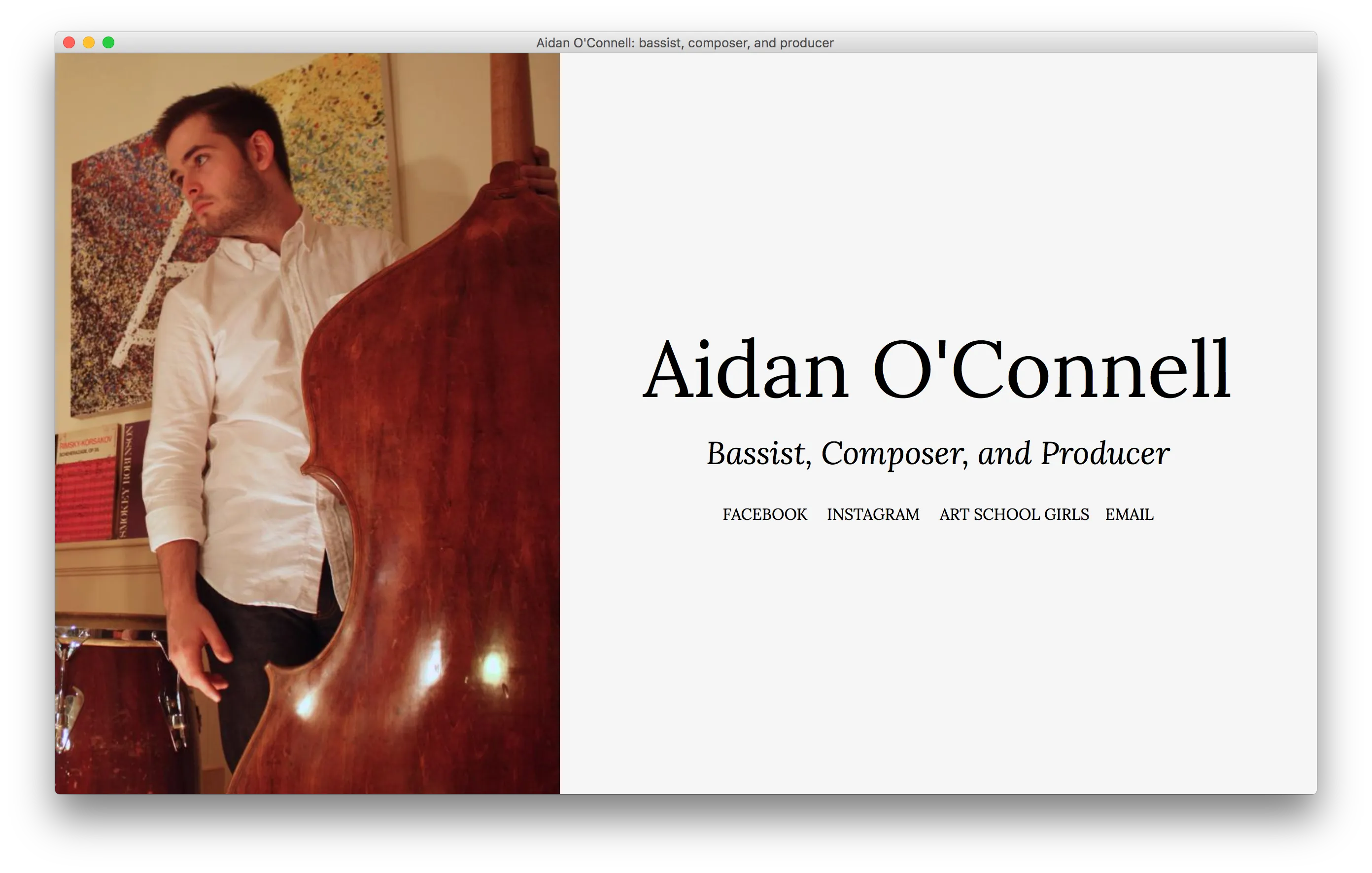
Aidan O'Connell
2016 | aidanoconnell.co
This is a simple landing page I made for Aidan O'Connell, a bassist, composer, and producer living in New York. The site is simple, but I like how the opening animation brings attention to the profile image.
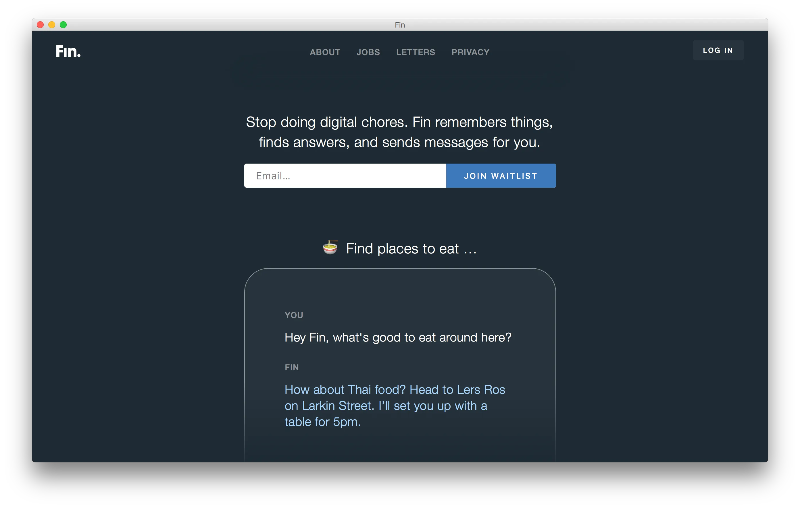
Fin
2015 | fin.com
The Fin team came to <a href="/teams/minimill">Minimill</a>, and asked us to help design their website and webapp. The result was a minimalist, dark-theme website that emphasized the conversational nature of their futuristic, science-fiction-esque conversational assistant.
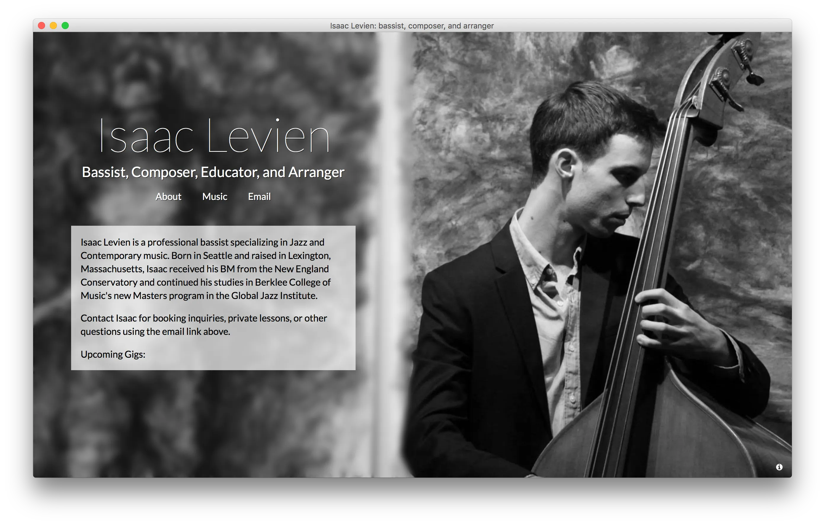
Isaac Levien
2015 | isaaclevien.com
I made this personal website / portfolio page for Isaac Levien, a bassist, composer, and educator living in Boston. To build his website, I wrote a simple CMS, letting him update the site with his latest performances and recordings.
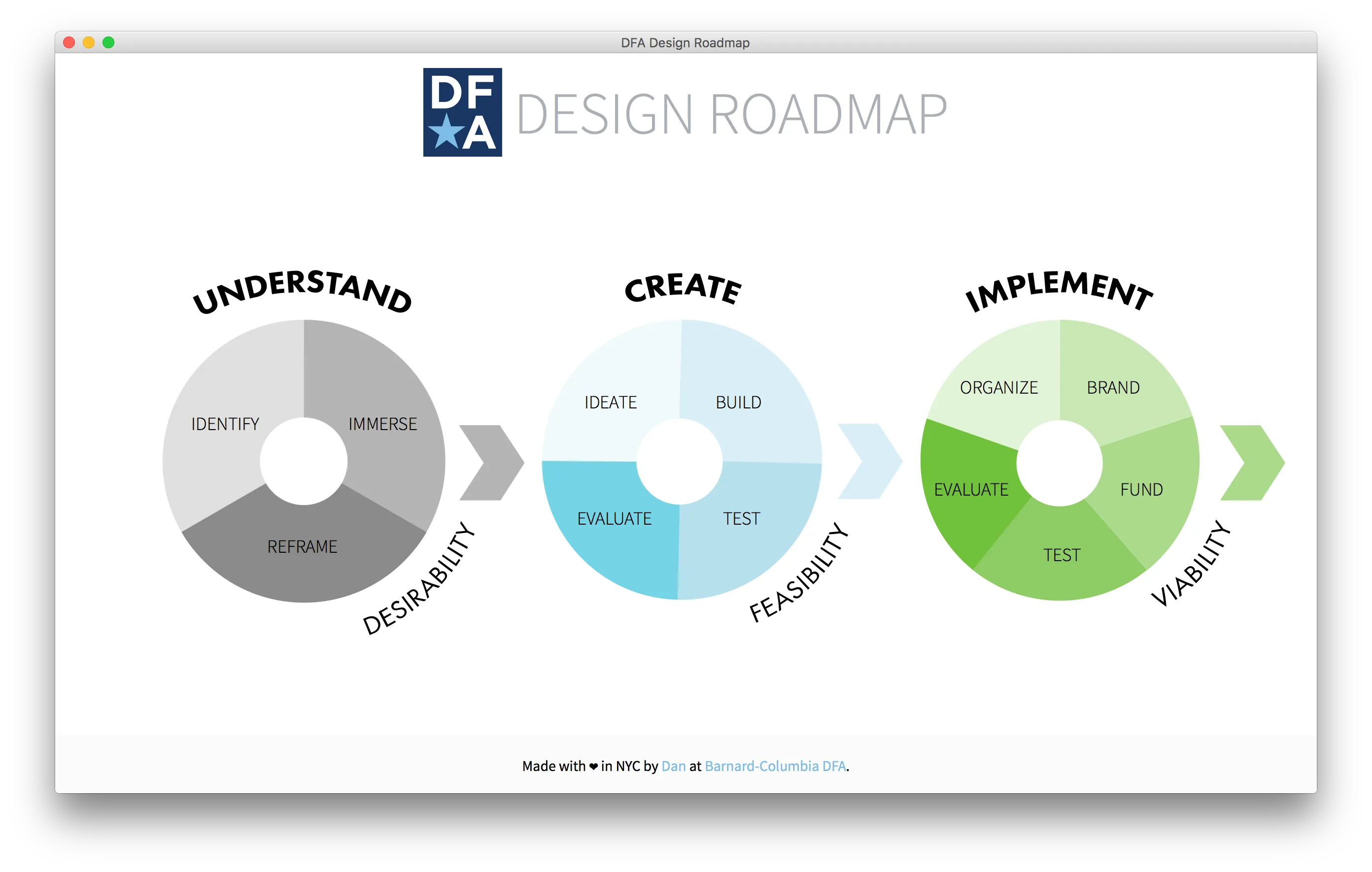
DFA Design Roadmap
2015 | roadmap.bcdfa.com
This was my first project using React. It serves as a resource for team members of the <a href="/teams/dfa/">Barnard-Columbia Design for America</a>, a chapter of a national organization that organizes students to give back to their communities using human centered design.
Spire
2015 | spire.minimill.co
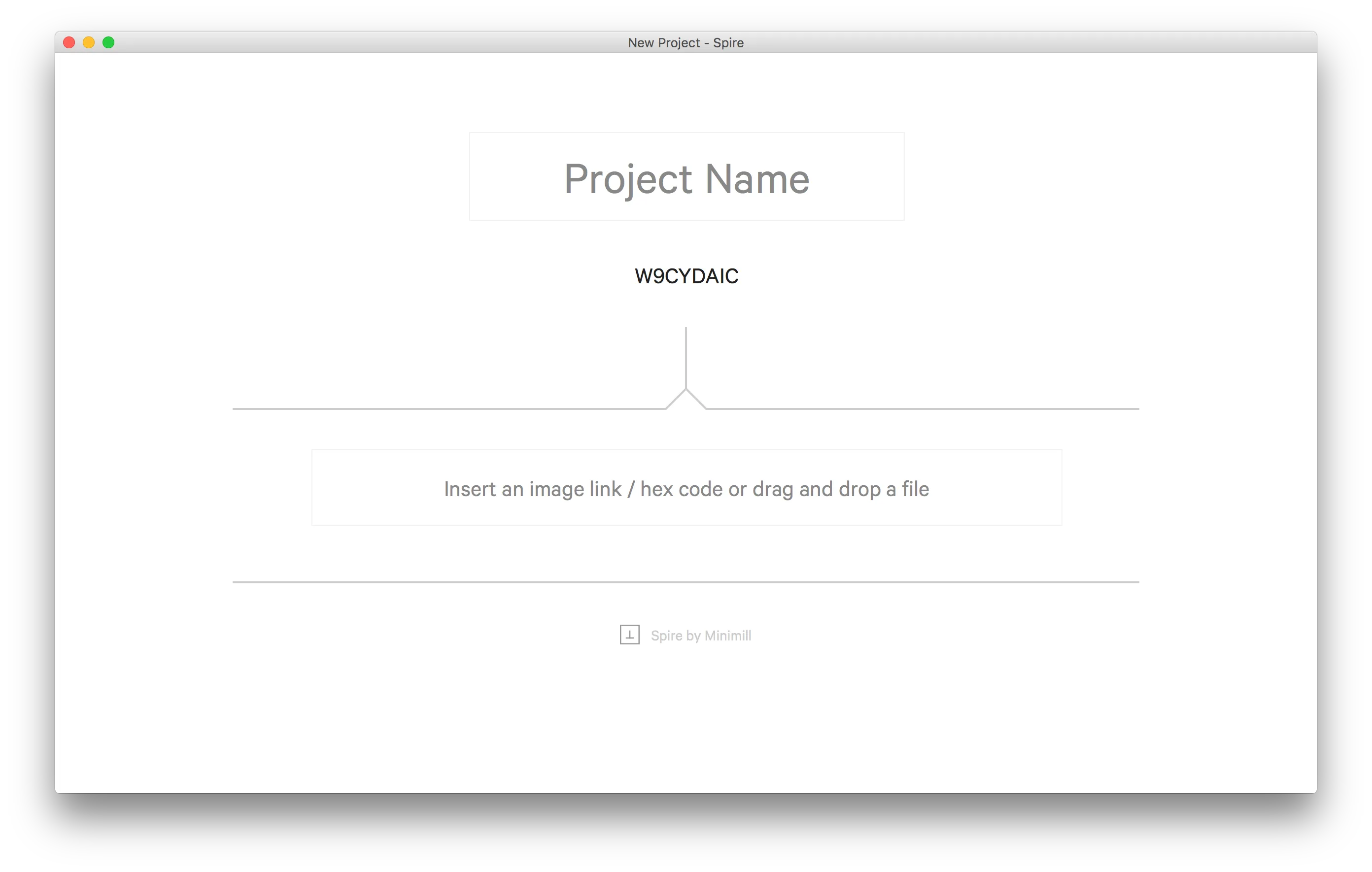
Spire is a low-friction mood board I made with <a href="http://jhil.co">Jeff Hilnbrand</a>. The idea was to make it as easy as possible to organize a few images, colors, and some text as inspiration for a project or art piece.
Substituteteacher.js
2015 | schlosser.github.io/substituteteacher.js
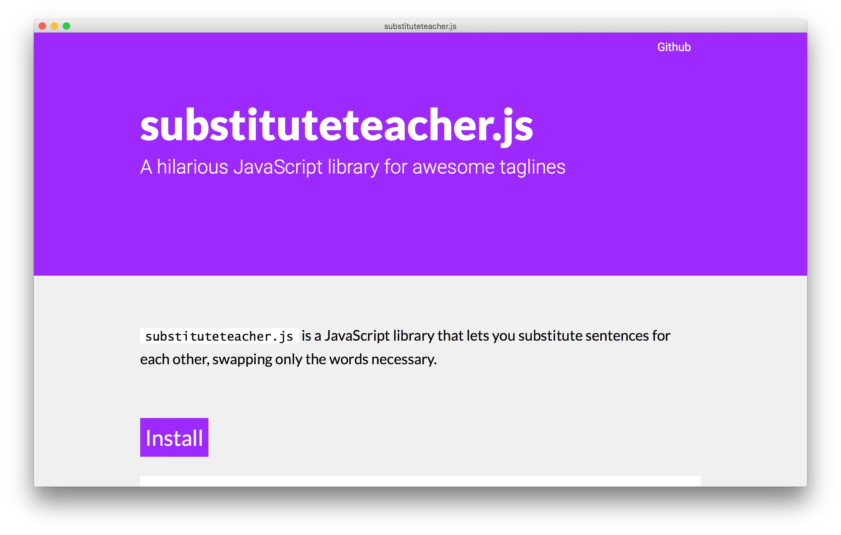
<a href="/projects/substituteteacher-js/">Substituteteacher.js</a> is a JavaScript library I wrote for exchanging multiple sentences as a single animated tagline for a website. I built this simple site to show it off and explain how to get started using it.
World After Capital
2015 | worldaftercapital.org
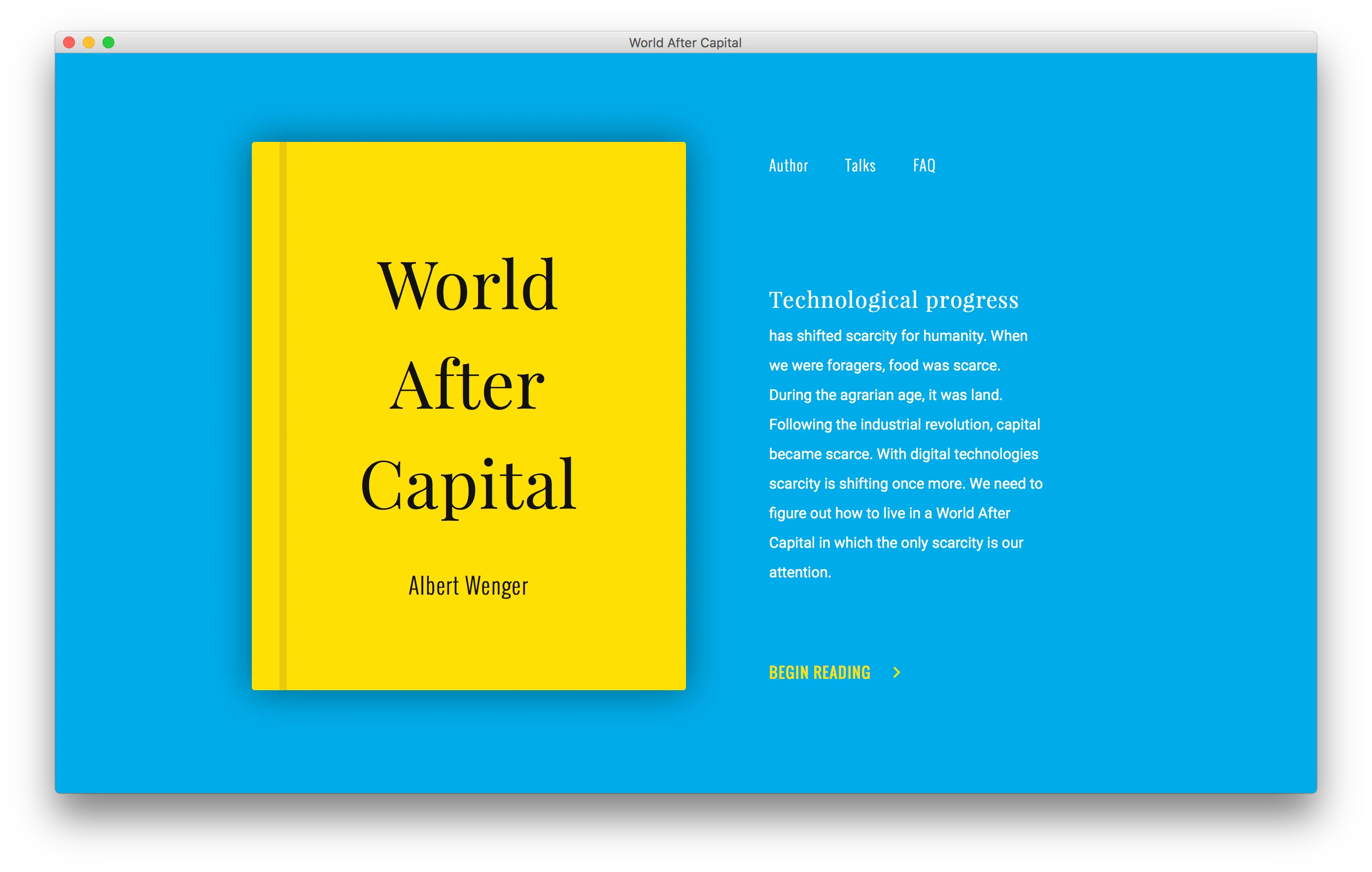
<a href="http://continuations.com/">Albert Wenger</a> came to <a href="/teams/minimill/">Minimill</a> and asked us to make a website and brand for his new e-book: World After Capital. We delivered a simple site that makes great use <a href="https://github.com/minimill/pangea.js/">pangea.js</a>, an animation framework I wrote from scratch for this project. Check out our <a href="https://minimill.co/unscan/">case study</a> for more.
Upchannel
2015 | upchannel.com
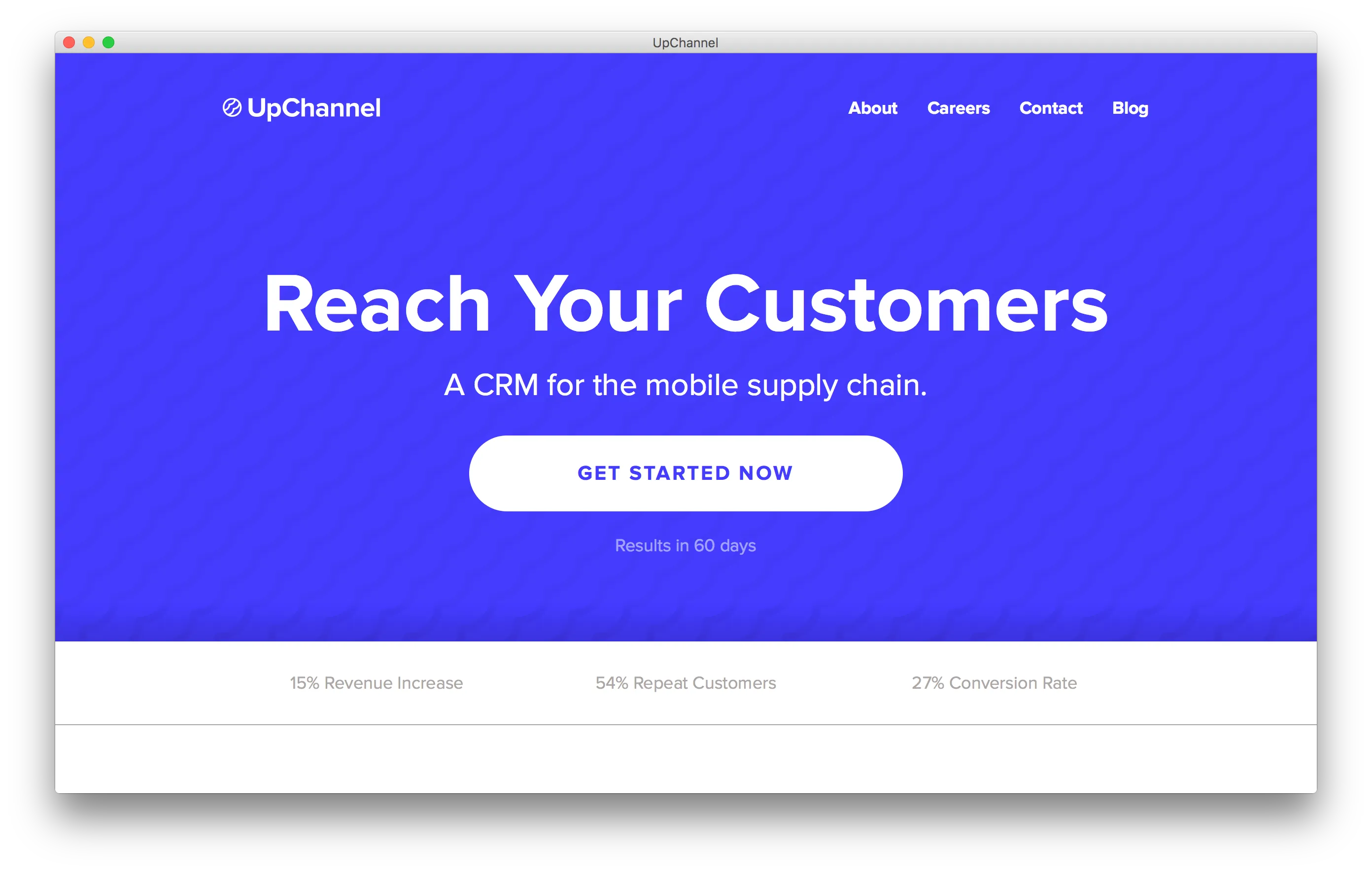
Upchannel came to <a href="/teams/minimill/">Minimill</a> with a challenging request: making a website and brand for a pretty un-sexy and confusing industry: software services for mobile app OEMs. After several iterations, we landed on a pretty great design. Check out our <a href="https://minimill.co/upchannel/">case study</a> for more.
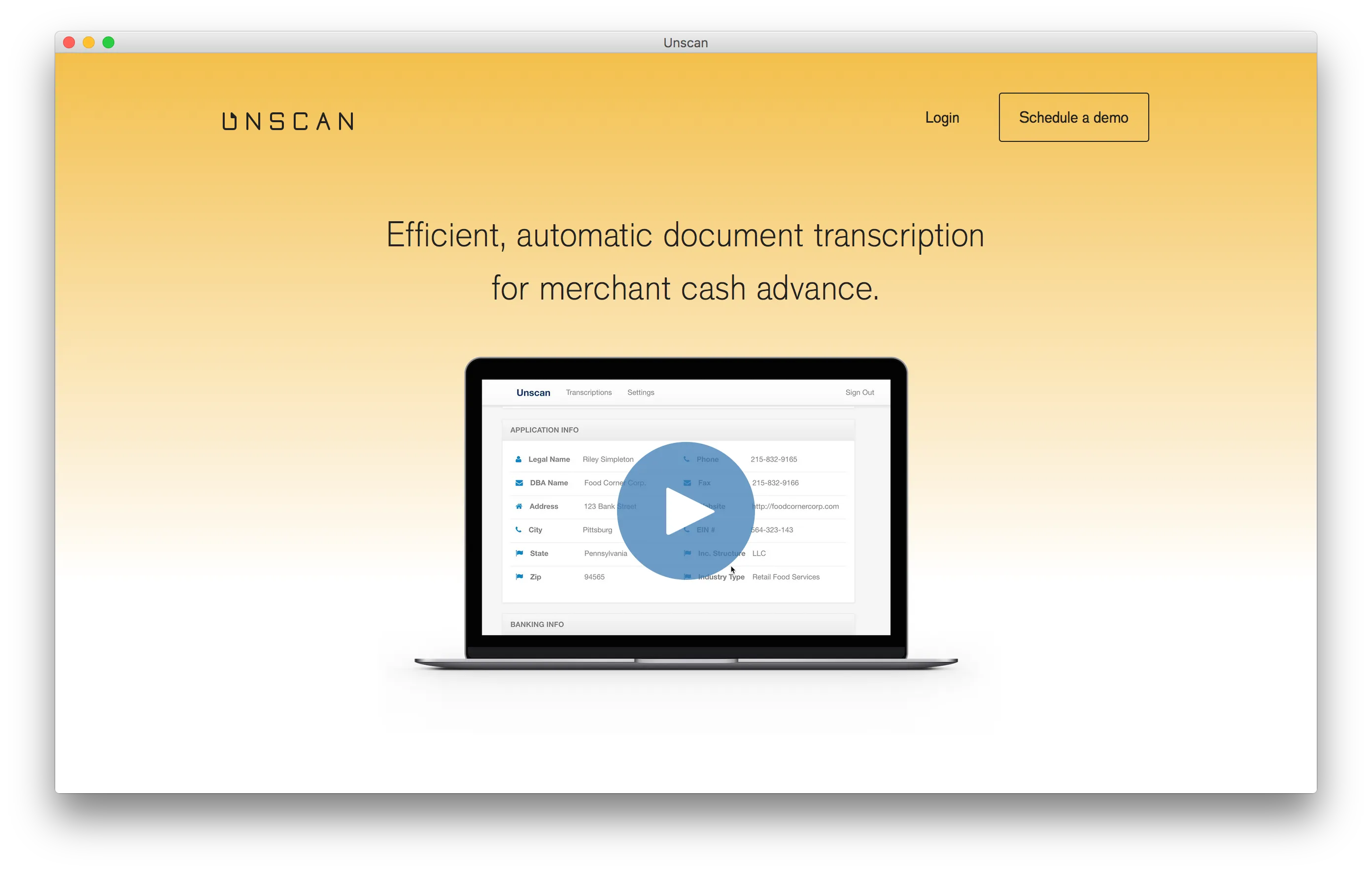
Unscan
2015 | unscan.com
Unscan was our first client at <a href="/teams/minimill/">Minimill</a>. A startup intent on disrupting the banking industry, Unscan wanted a website that would give their customers confidence in their product. Check out our <a href="https://minimill.co/unscan/">case study</a> for more.
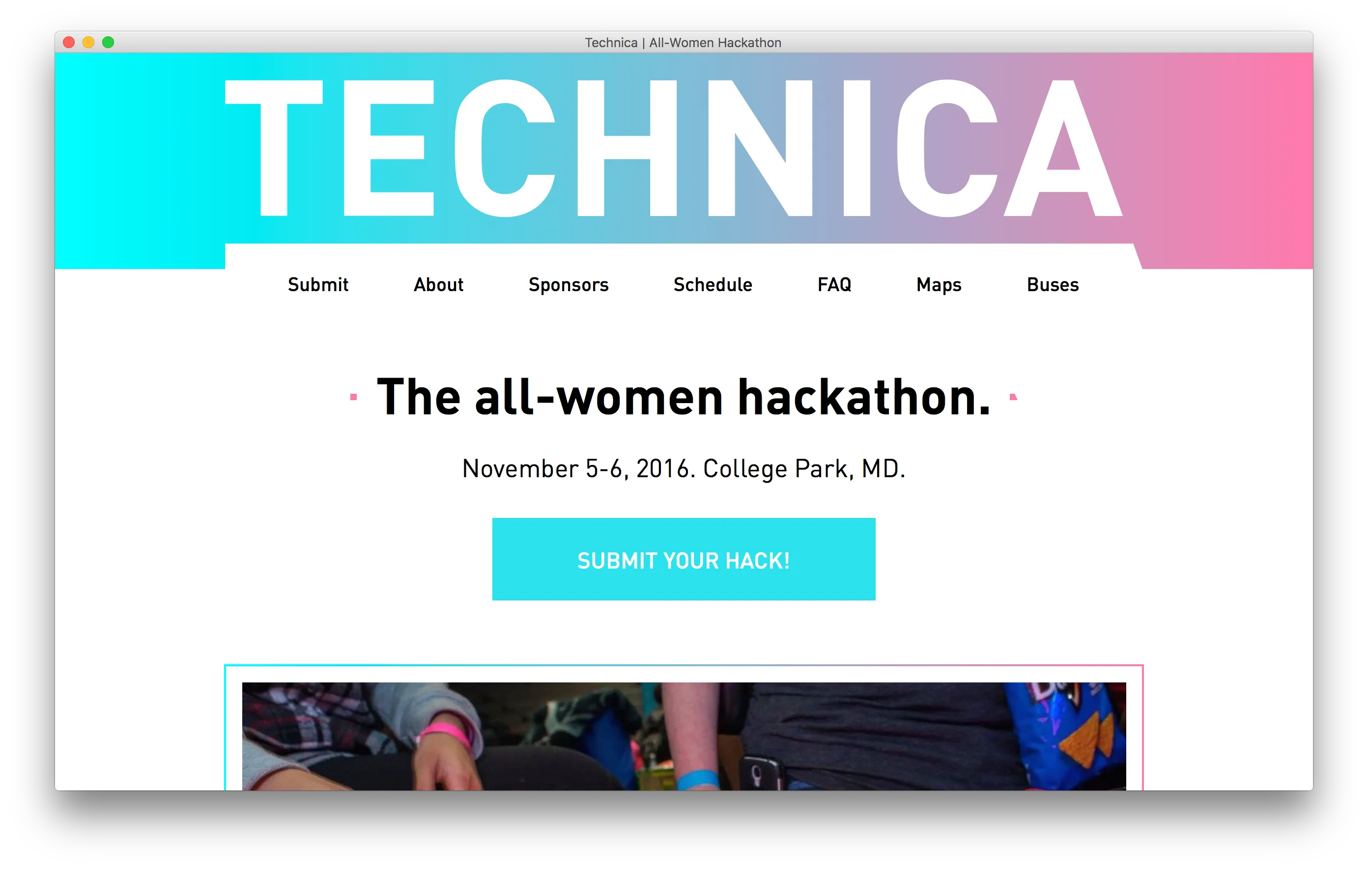
Techncia
2015 | gotechnica.org
This is the website for Techinca, an all-women hackathon at University of Maryland. Built in a time crunch (only a few days!), the site was my first experiences using <a href="https://zeplin.io/">Zeplin</a> and <a href="http://gulpjs.com/">Gulp</a>, two tools that I now rely on to be productive.
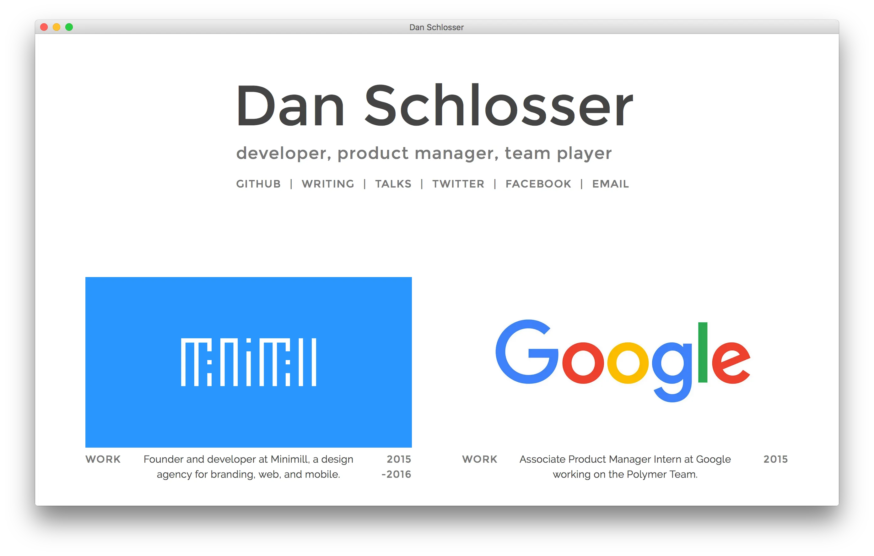
My Personal Website (2015)
2015 | 2015.schlosser.io
This was my third incarnation of a personal website. It placed a focus on communicating my resume, projects, and writing all in one feed. It was also the first personal website that I made that made use of my <a href="/writing/respect-yourself-use-gulp/">project template</a>.
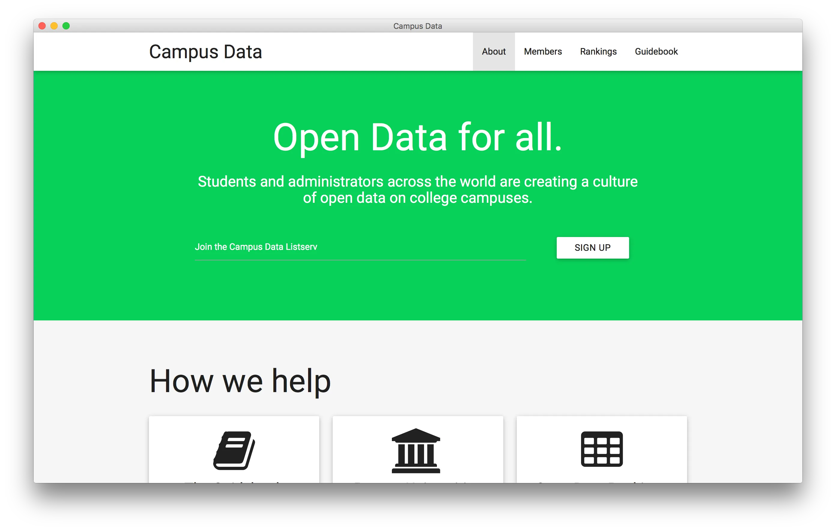
Campus Data
2015 | campusdata.github.io
I remade the website for <a href="/teams/campus-data/">Campus Data</a> in Jekyll, using <a href="http://materializecss.com/">Materialize</a>, a CSS framework for Material Design. Campus Data is an organization that promotes open data at universities. My additions to the site include the <a href="https://campusdata.github.io/rankings/">Campus Data Rankings</a> table.
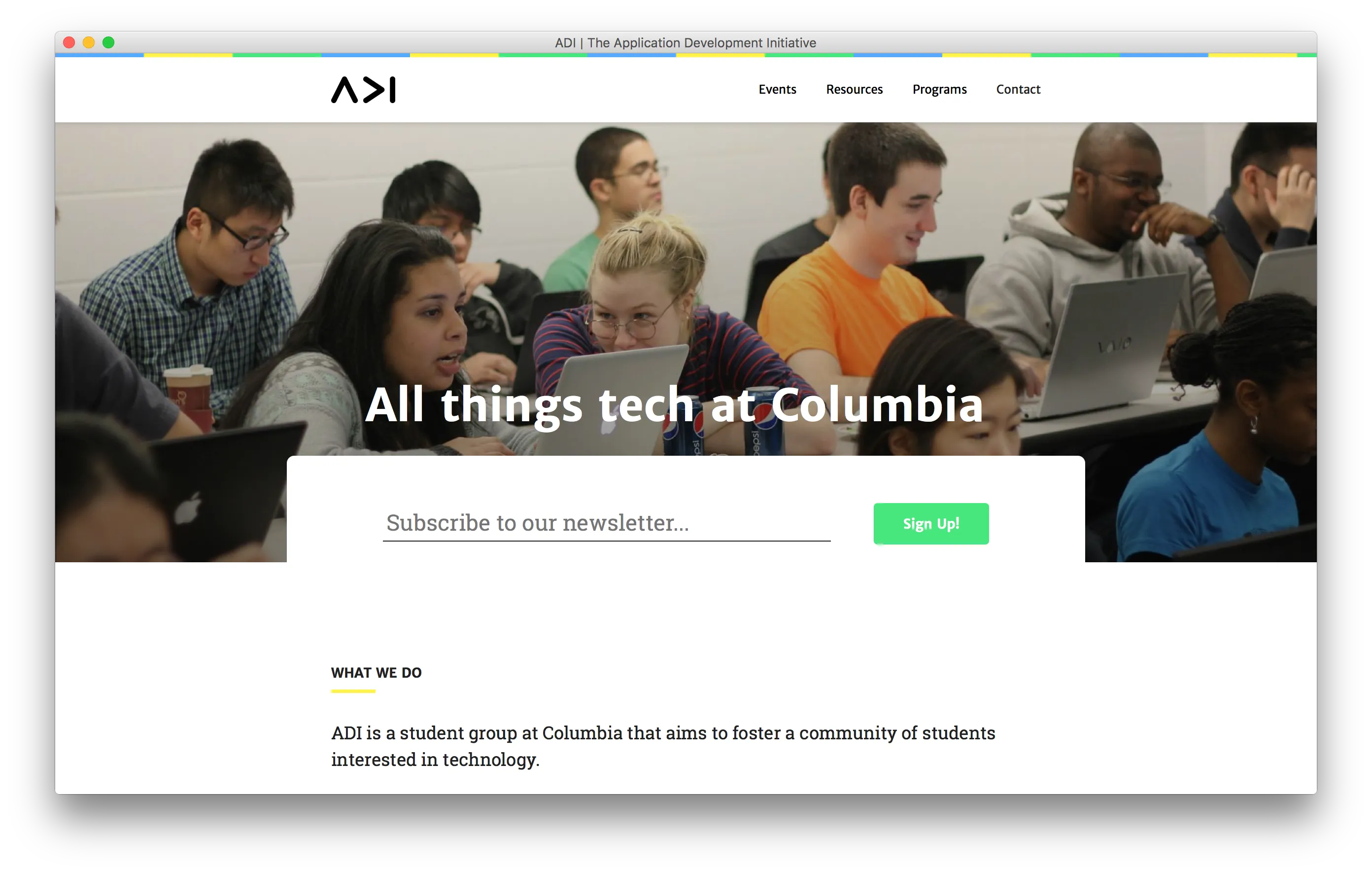
ADI Website
2014 | adicu.com
I built this website for ADI, the Application Development Initiative, the tech club at Columbia that I was a member of for my four years there. I made the ADI website using <a href="/projects/eventum/">Eventum</a> for a CMS. The site design and ADI logo are by <a href="http://jhil.co">Jeff Hilnbrand</a>.
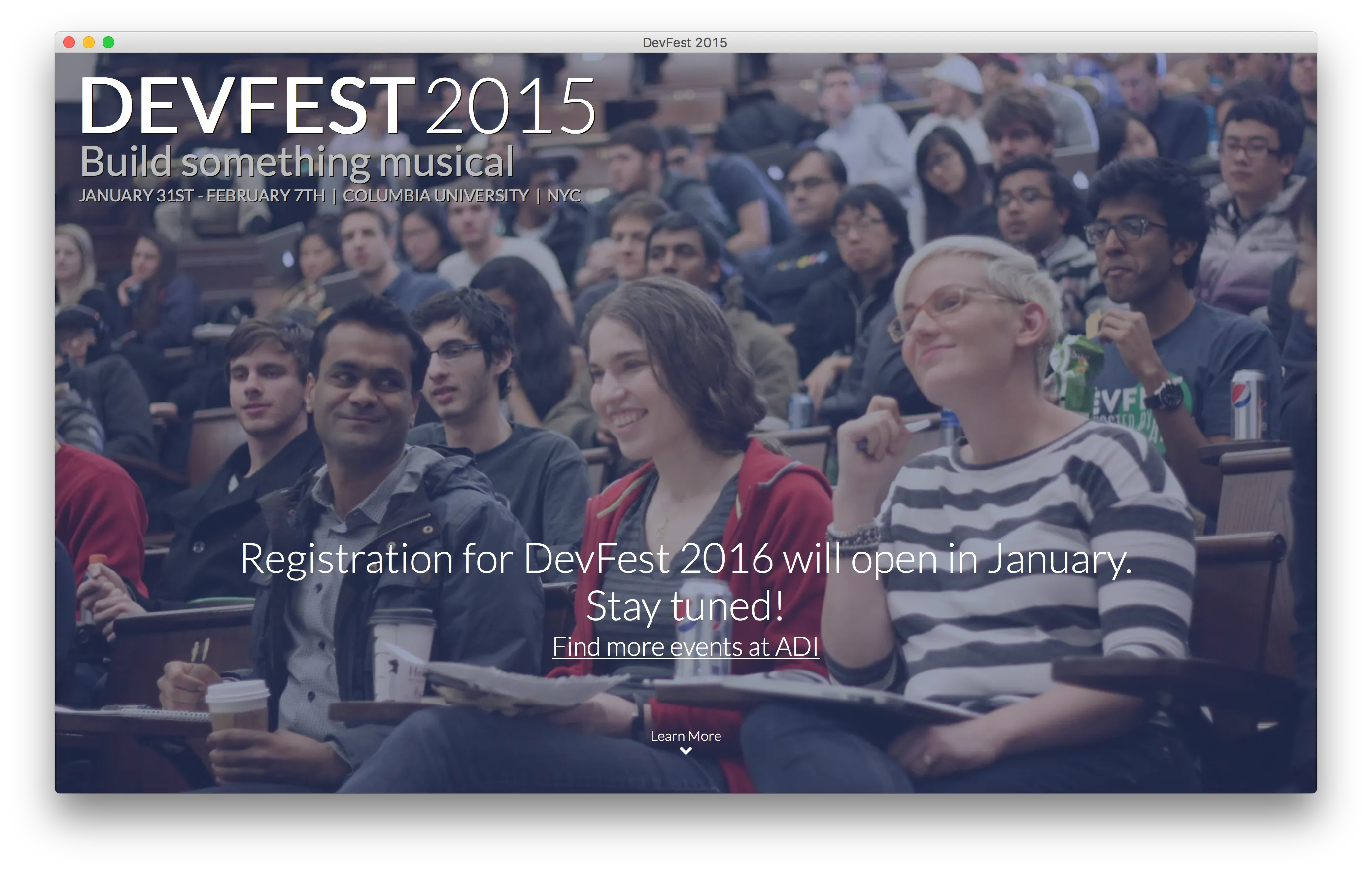
DevFest (2015)
2014 | 2015.devfe.st
I designed and built this website for <a href="http://devfe.st">DevFest</a>, a hackathon run by <a href="https://adicu.com">ADI</a>, the tech club at Columbia, which I was a member of for my four years there. This site was really fun to make, as it was one of my first sites to make great use of jQuery scroll handling.
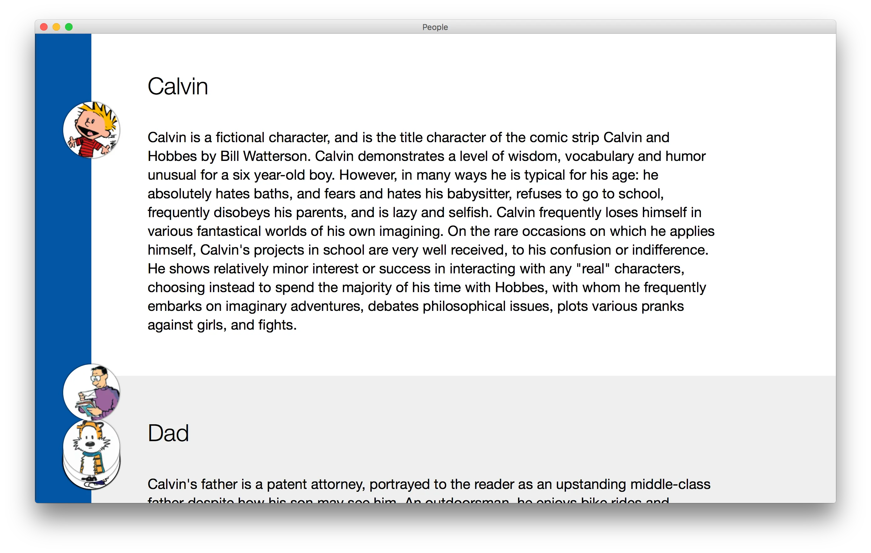
People Nav
2014 | static.schlosser.io/people-nav
I made this website while playing around with different effects in jQuery. I liked the idea of having a collection of discs that moved around in parallax with the content, but in a related way, and that they would stack in a way that felt logical.
